


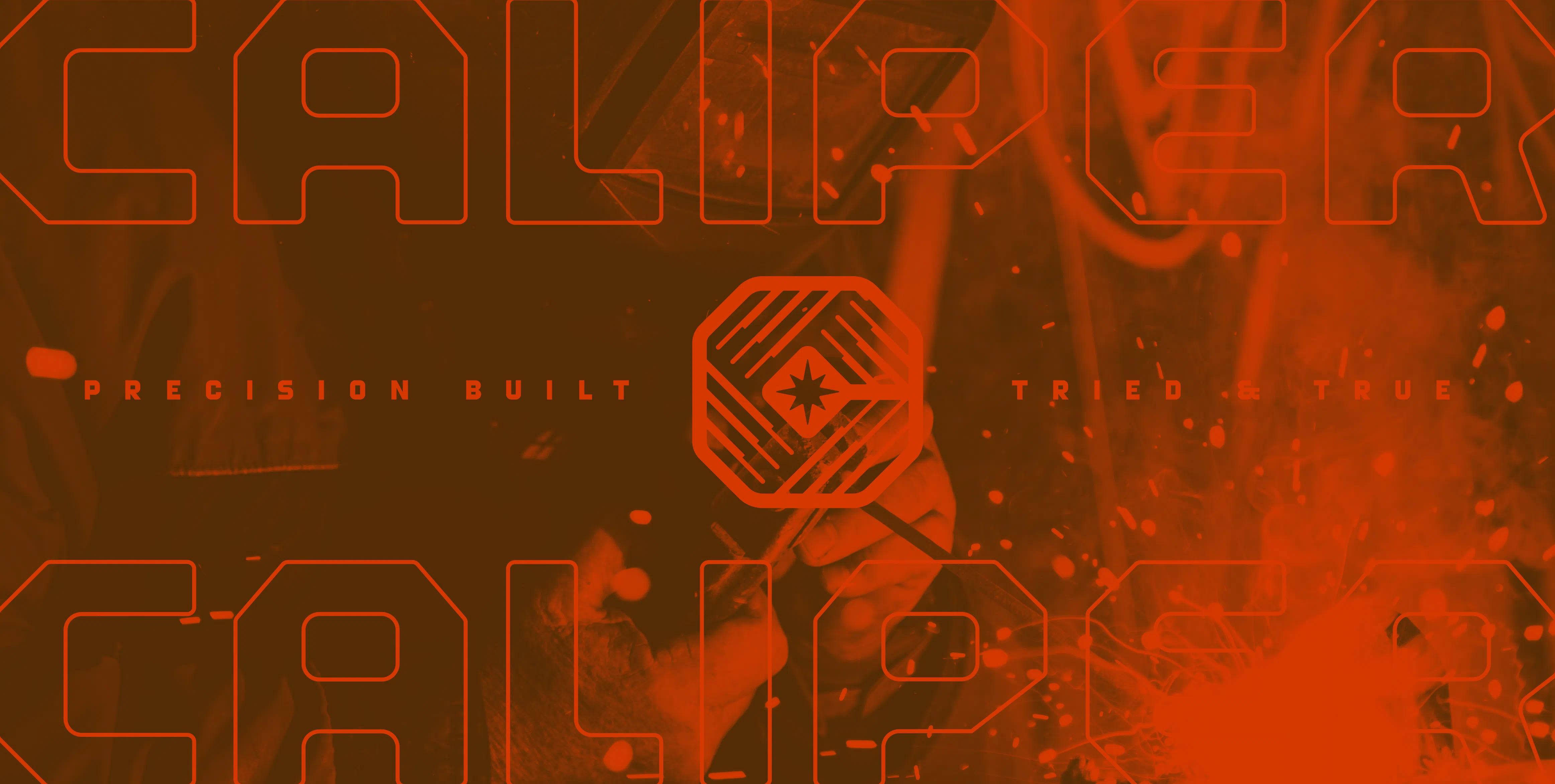
Caliper Machine
Capturing the spark of 50+ years of welding & machining legacy.
Branding | Apparel Design | Custom Type | Print Design
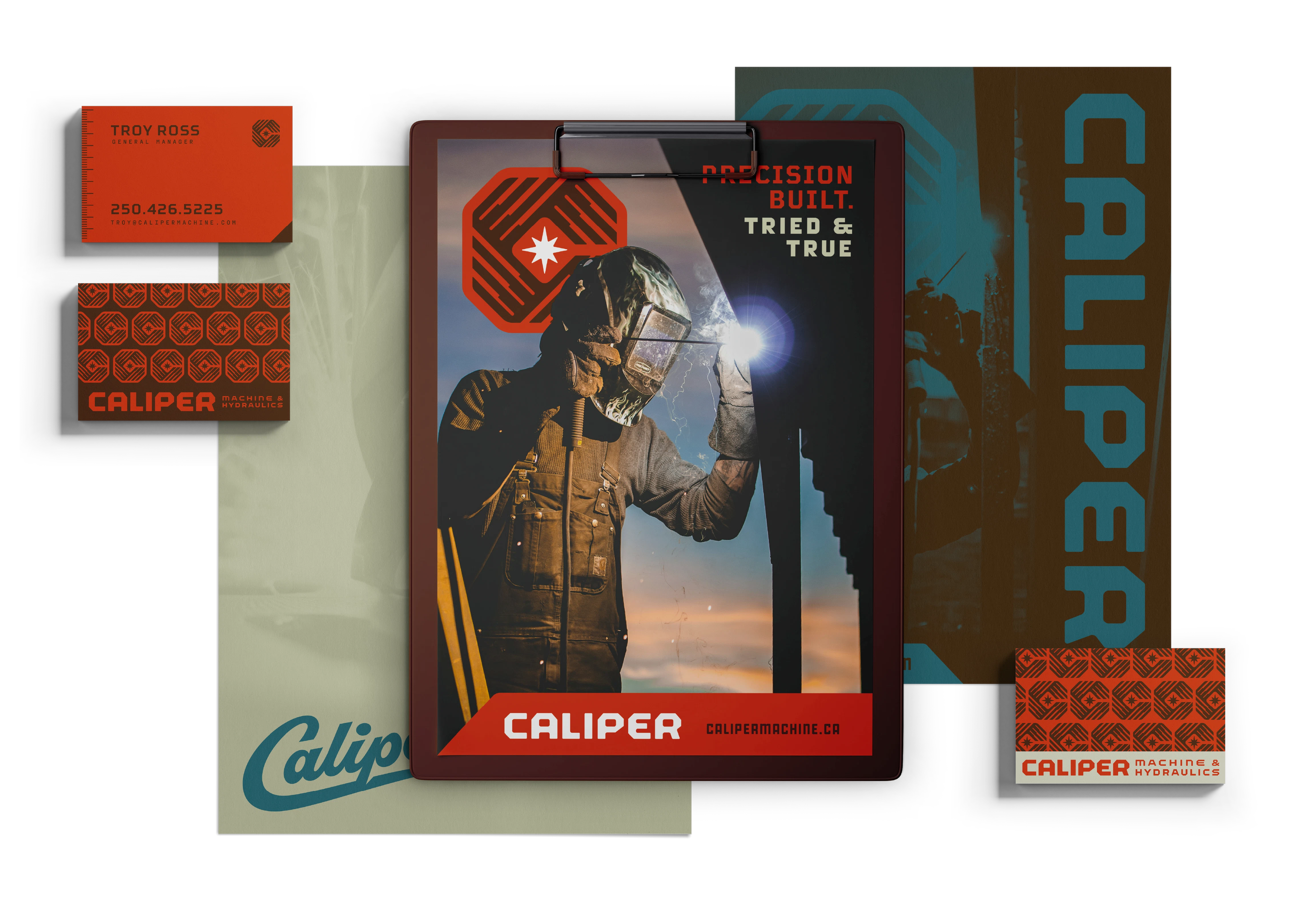

Brand Kit
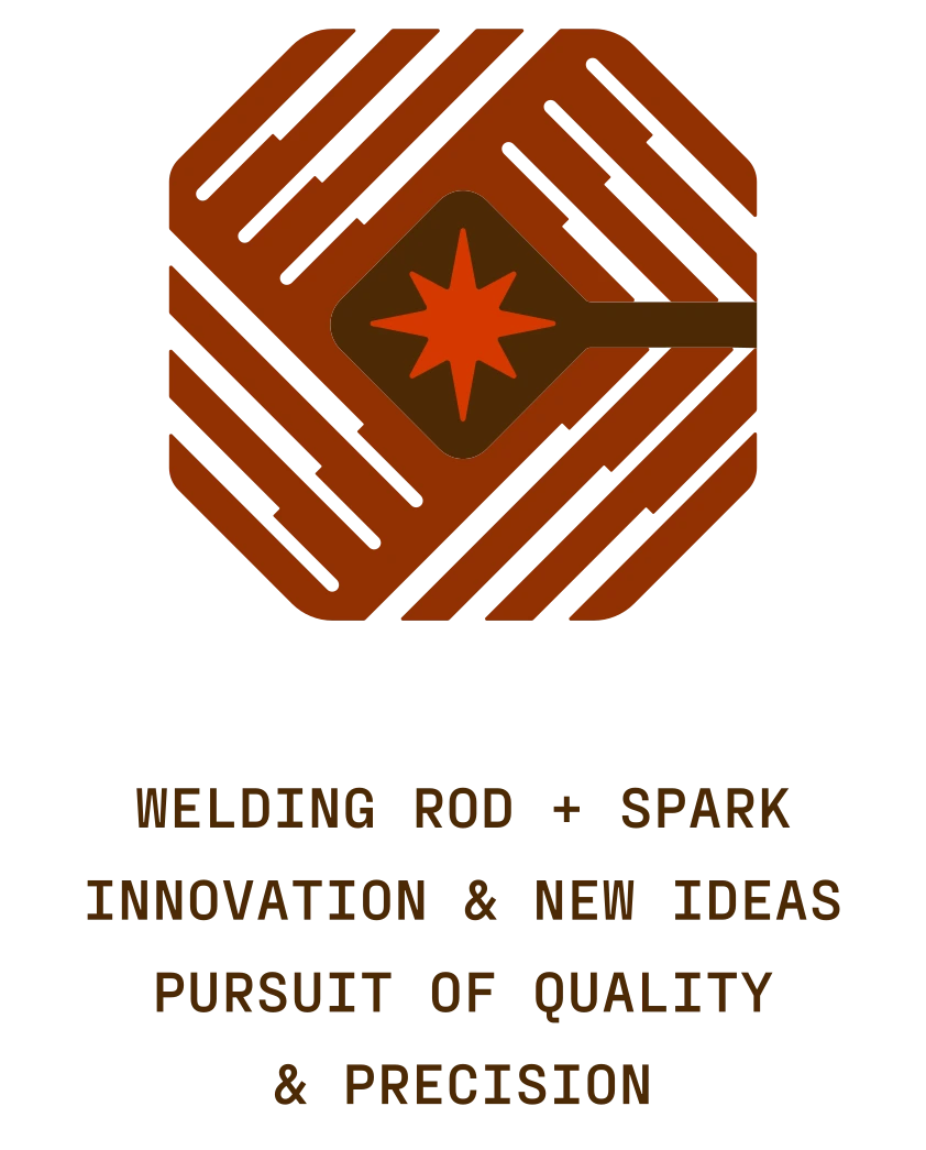
The brand icon is designed to capture Caliper’s innate attention to detail, combining clear, accurate lines to form the shape of a “C”. We also packed a few more subtle references into the icon to build a nice sense of depth and story -- more details on that below!
Built on that foundation, everything about the identity’s core elements is designed to feel precise and easy to imagine laser-cut into a chunk of steel.
Balancing the whole identity is a custom script mark that provides a break from the clean lines with a handmade feel that reminds viewers the company is run by real people.
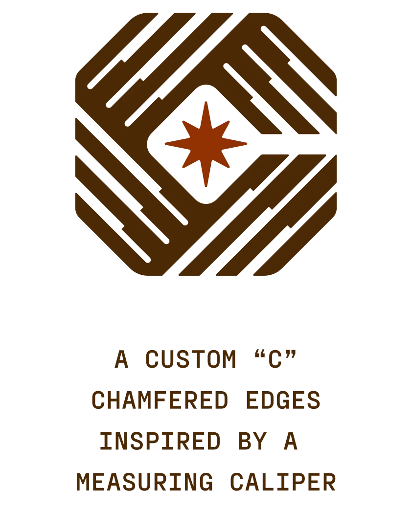
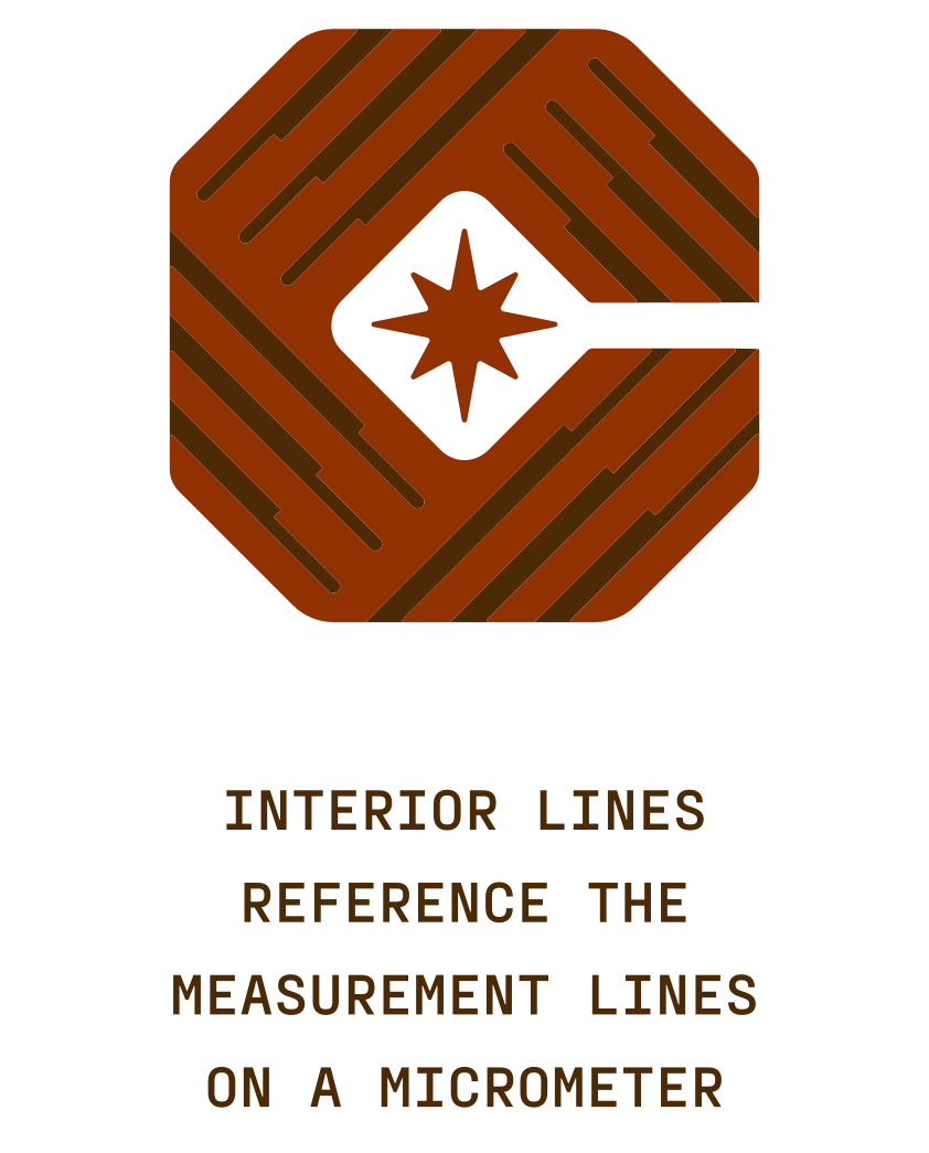
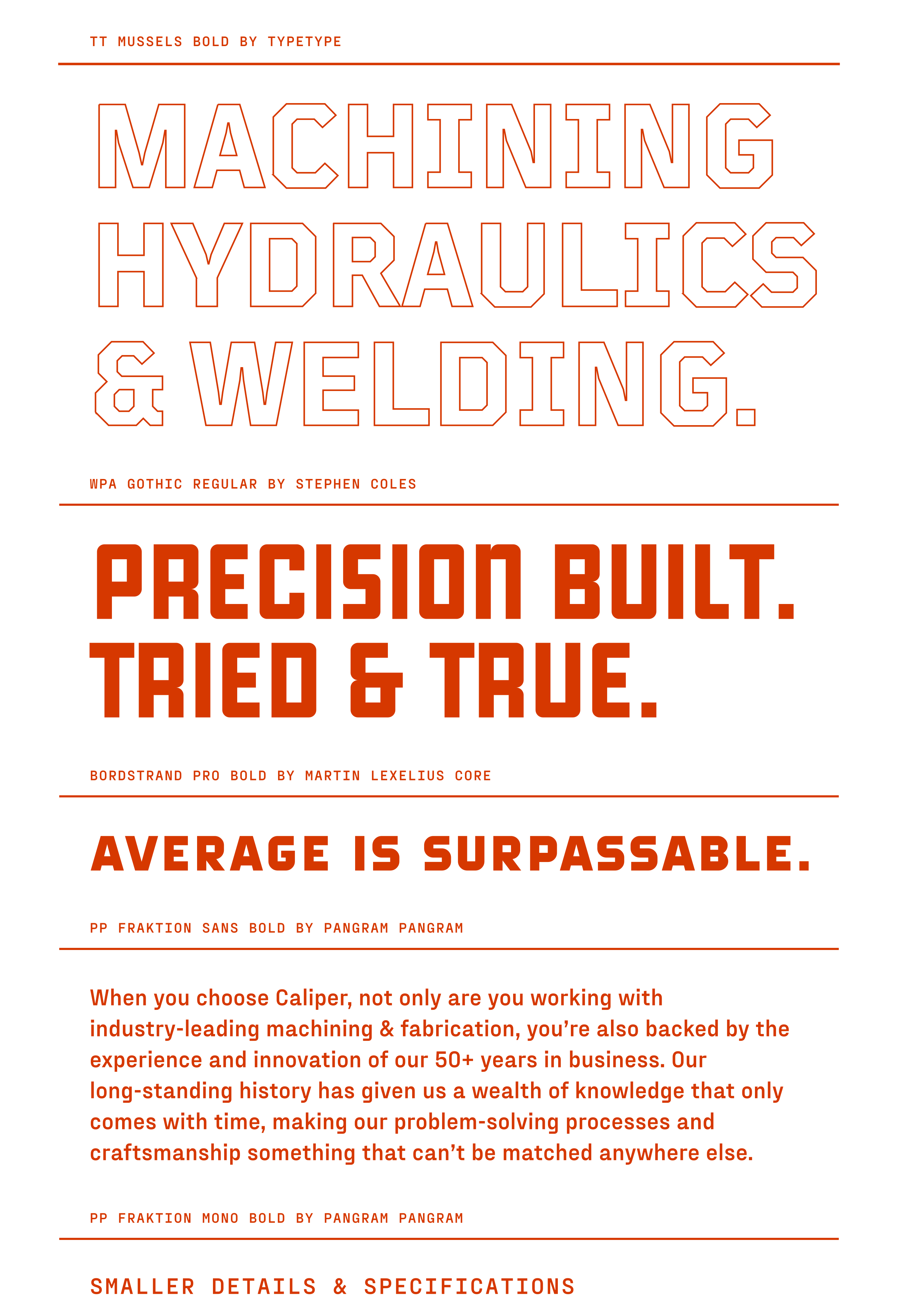
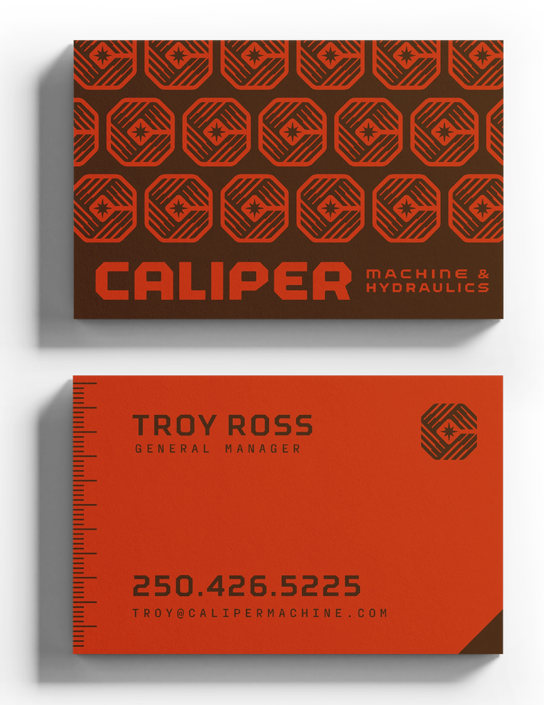
Warm colour, a collection of patterns, and a combo of modern & classic industrial typography create a timeless aesthetic that feels storied & trustworthy while being extremely usable and flexible.
Badges & Emblems
To give the identity even more depth and character, we developed a collection of badges and emblems inspired by the manufacturing labels often found on the side of heavy duty tools and machinery.
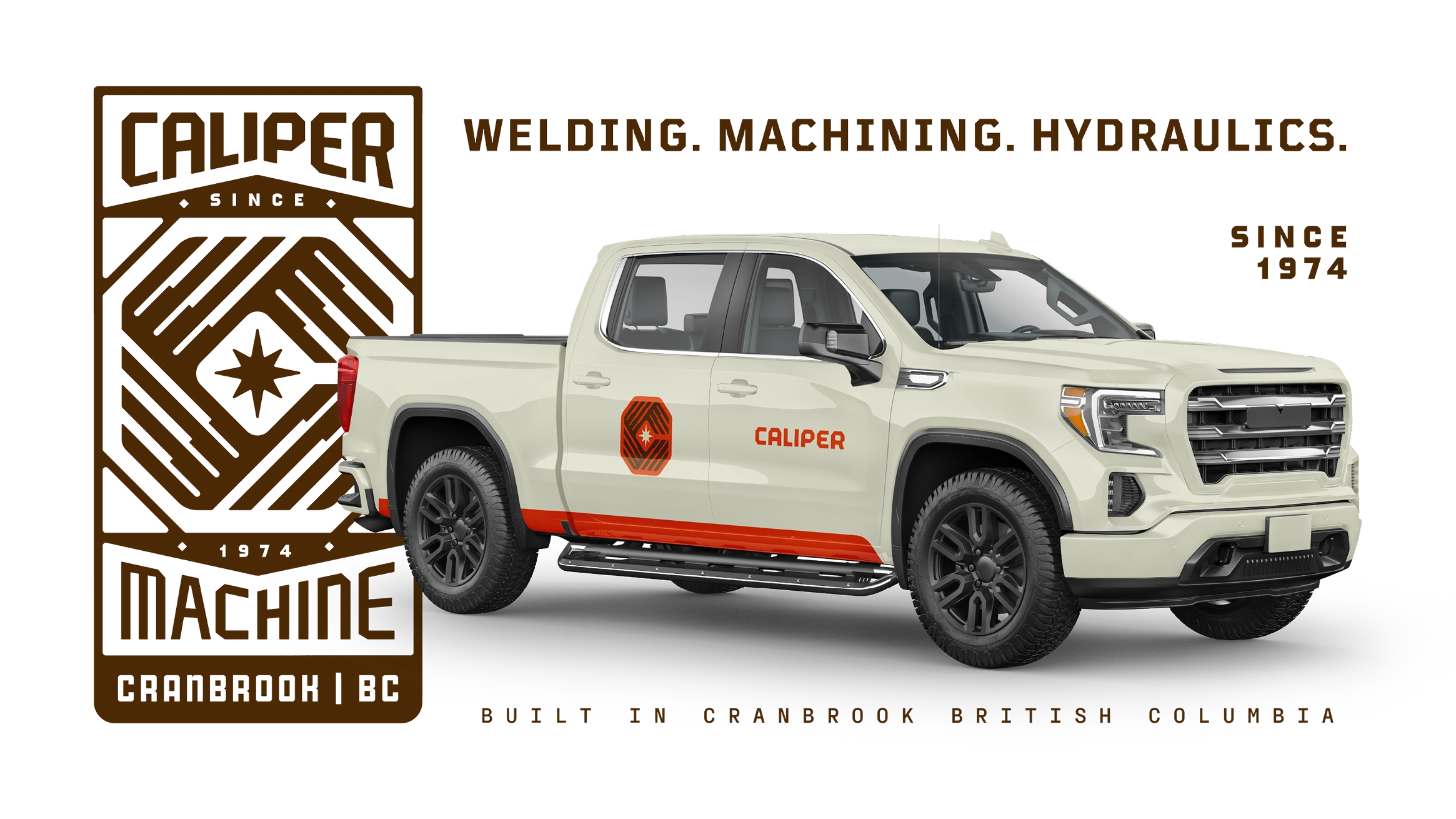

To make the brand toolkit even more flexible, we designed a large arsenal of contextual alternates to ensure the brand always looks its best, no matter the size or aspect ratio.
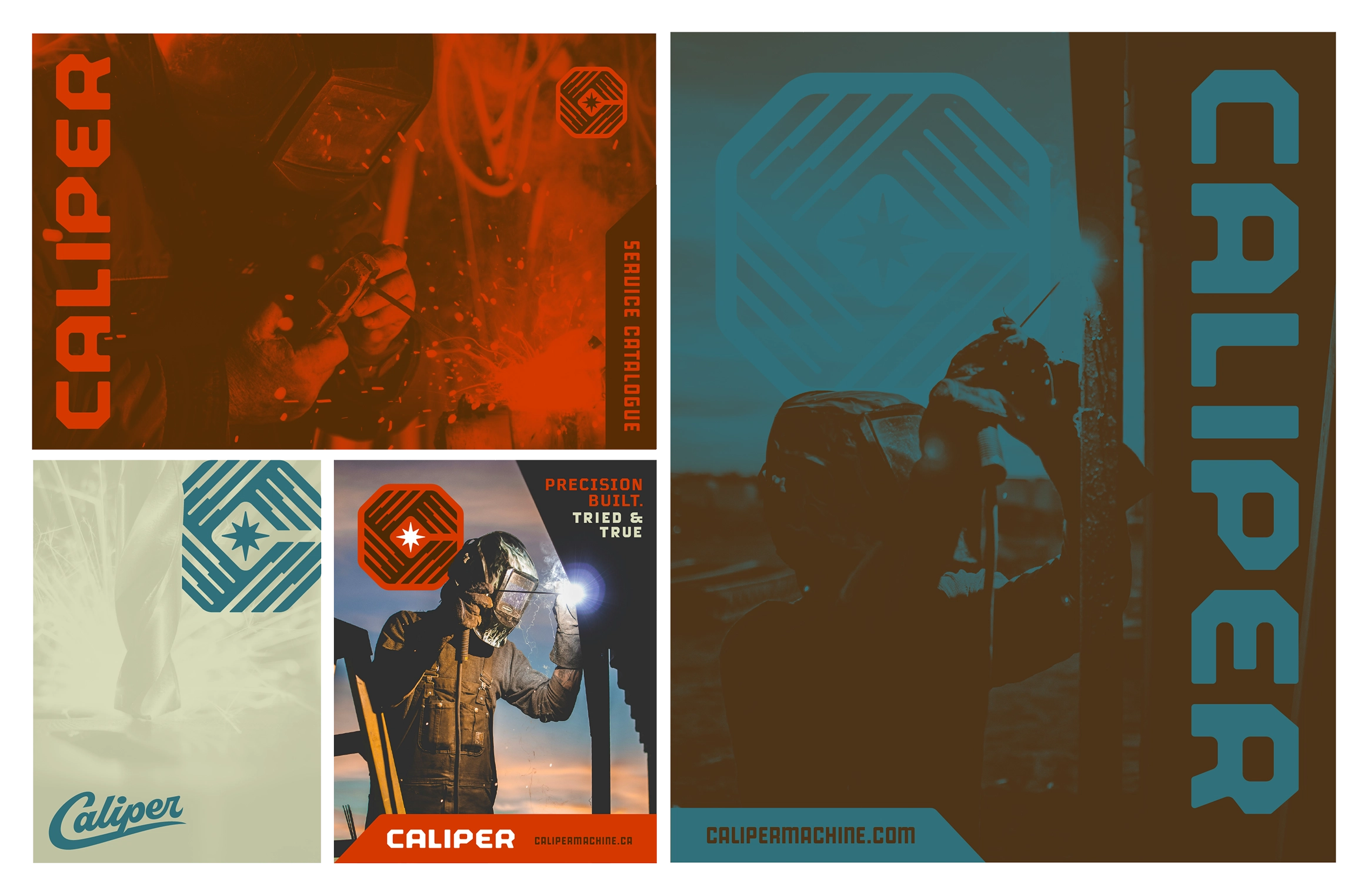
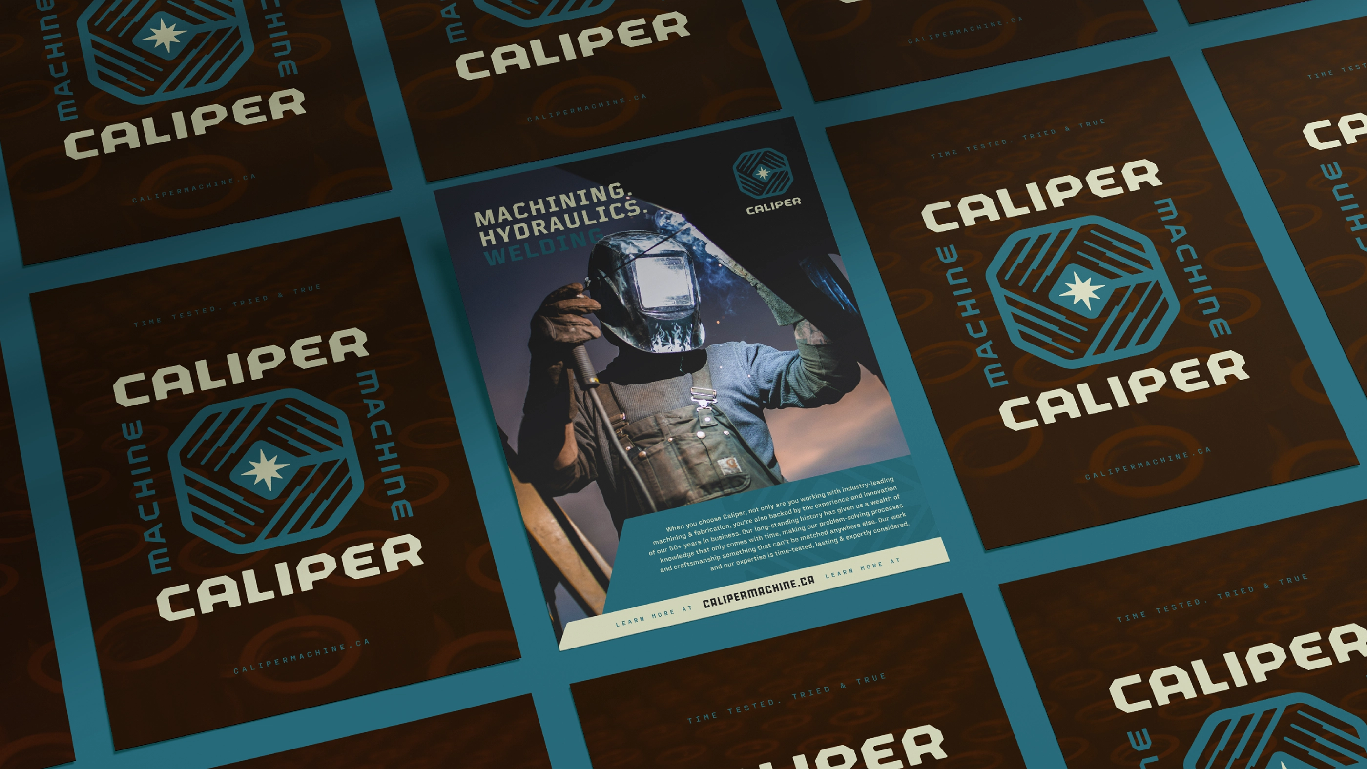
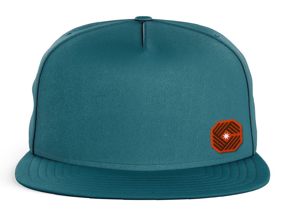
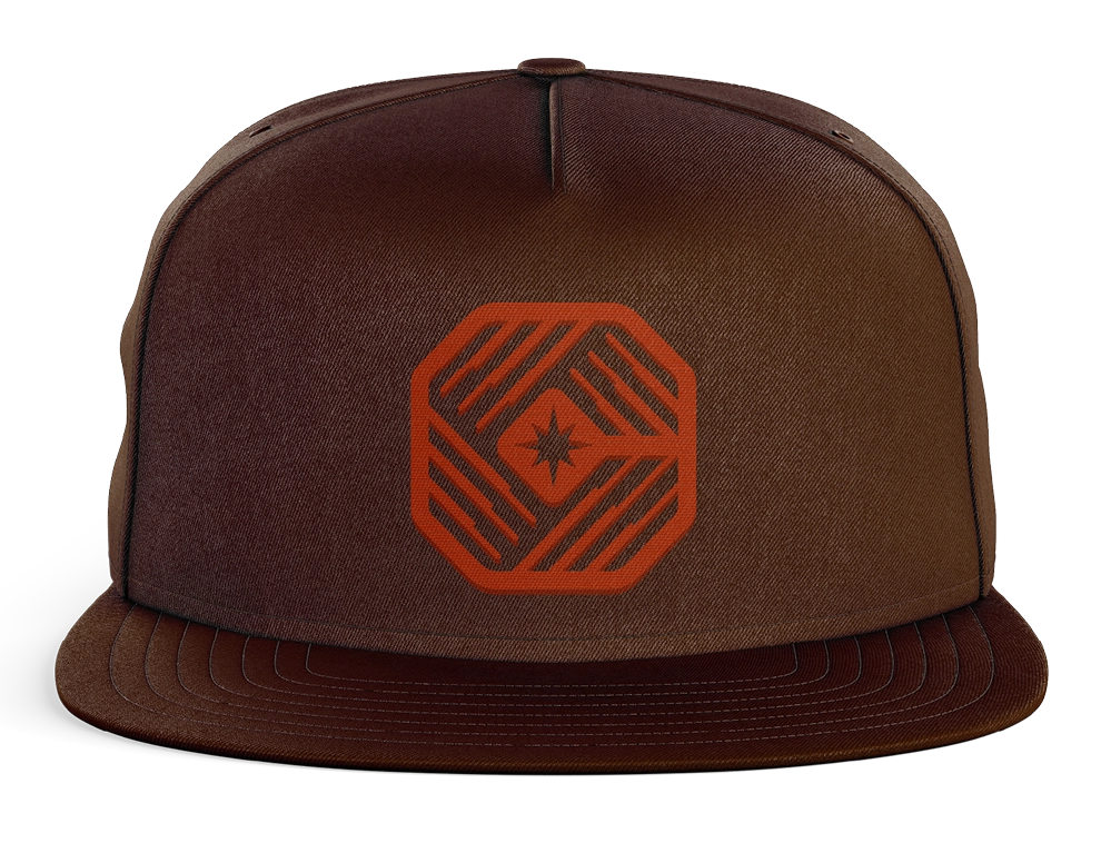
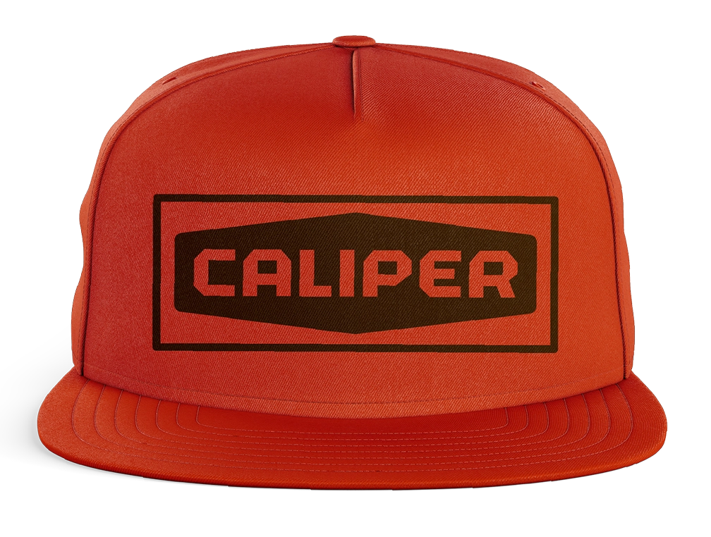
The brand is brought to life in context through custom staff apparel and printed products.
An instruction manual you actually want to read.
We assembled an in-depth brand standards guide to make sure that every time the brand is used internally, it lives up to Caliper’s long-standing reputation.

craft brewery & bowling alley
craft brewery & bowling alley