


Kimberley Brewing
an adventure inspired craft brewery from Canada’s highest city.
Branding | Custom Type | Illustration | Packaging


Brand Kit
The brand icon assembles dozens of “mini mountains” together, forming a geometric “K”.
Paired with custom drawn type inspired by the legendary outdoor outfitting brands of the 80s, the brand kit builds a rich retro feel, while making KBC right at home on any mountain adventure.
Type & Colour
Pulled directly from 80s ski jacket catalogs, the colour palette creates a great sense of energy, while allowing the brand to clean up when necessary.
A collection of well matched typefaces brings an authentic retro look with just enough modern flair to not feel cheesy.


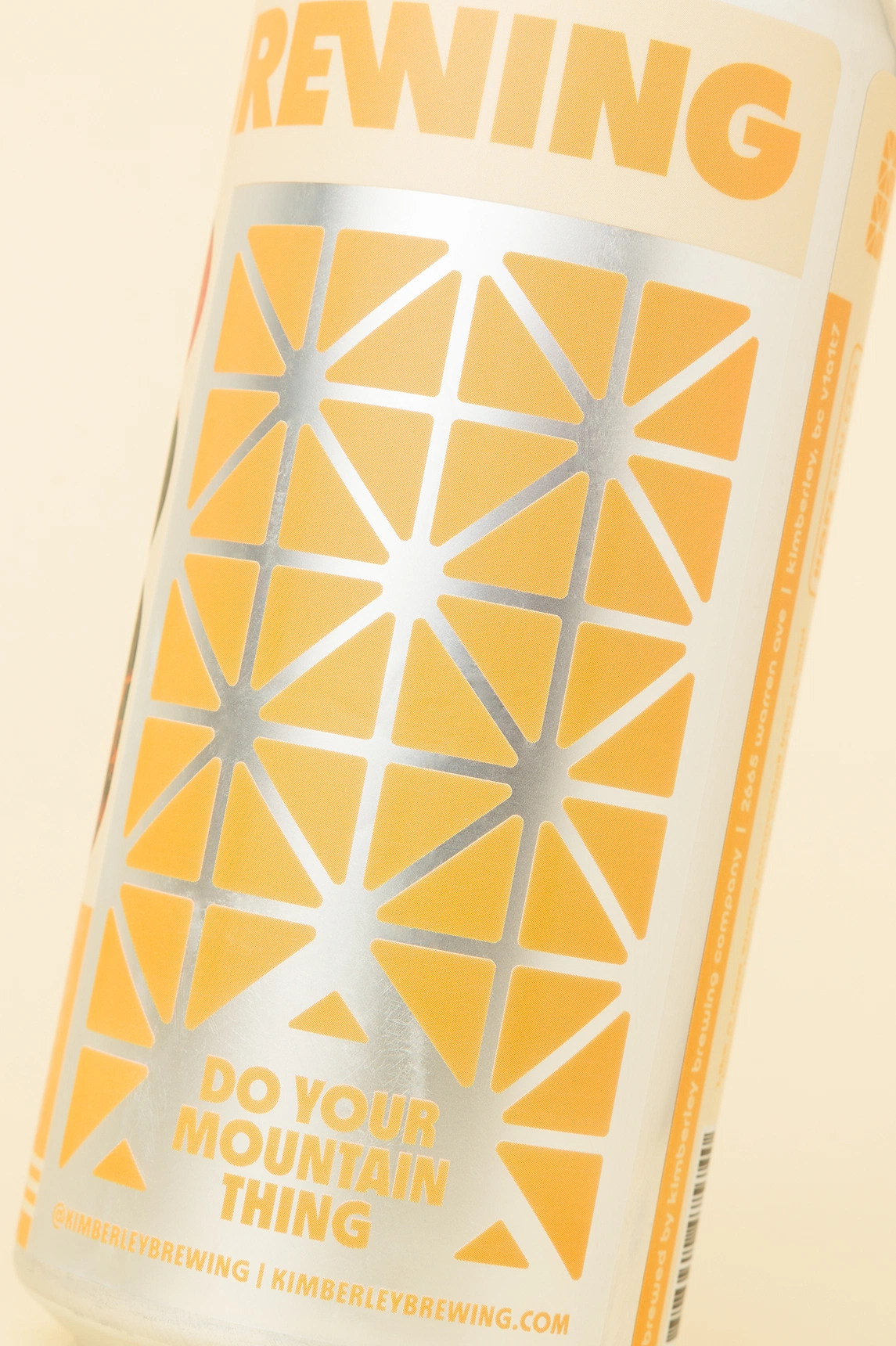
The Cans
The label system brings the brand spirit into a grab & go format, making sure every can is packed with personality.
A large wordmark spans the entire circumference of the can, encouraging customers to spin and explore. A rotated “K” icon creates picture perfect brand moments anytime the can is being sipped.


Retro inspired colour palettes, minimalist 80s style illustration, and vintage photo treatments ensure the cans are easily identifiable on the busy shelves of liquor stores.


craft brewery & bowling alley
craft brewery & bowling alley
craft brewery & bowling alley