

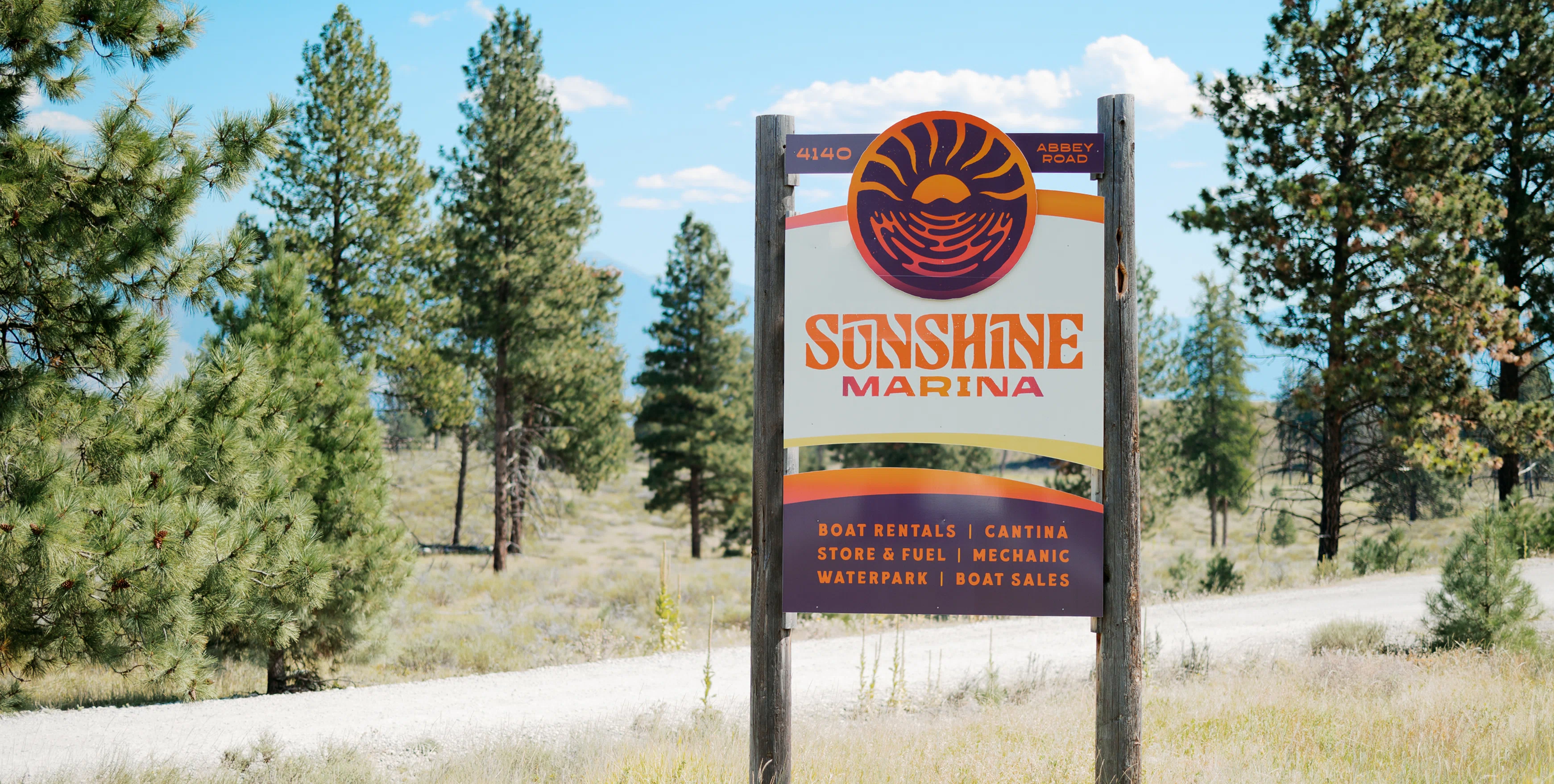
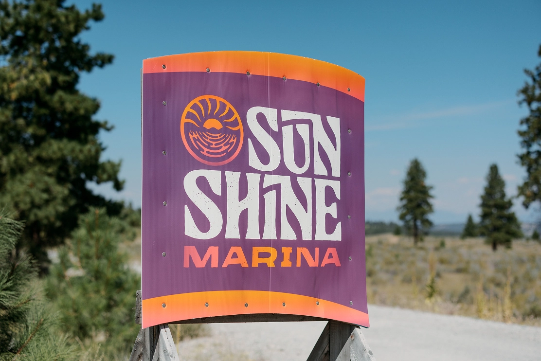
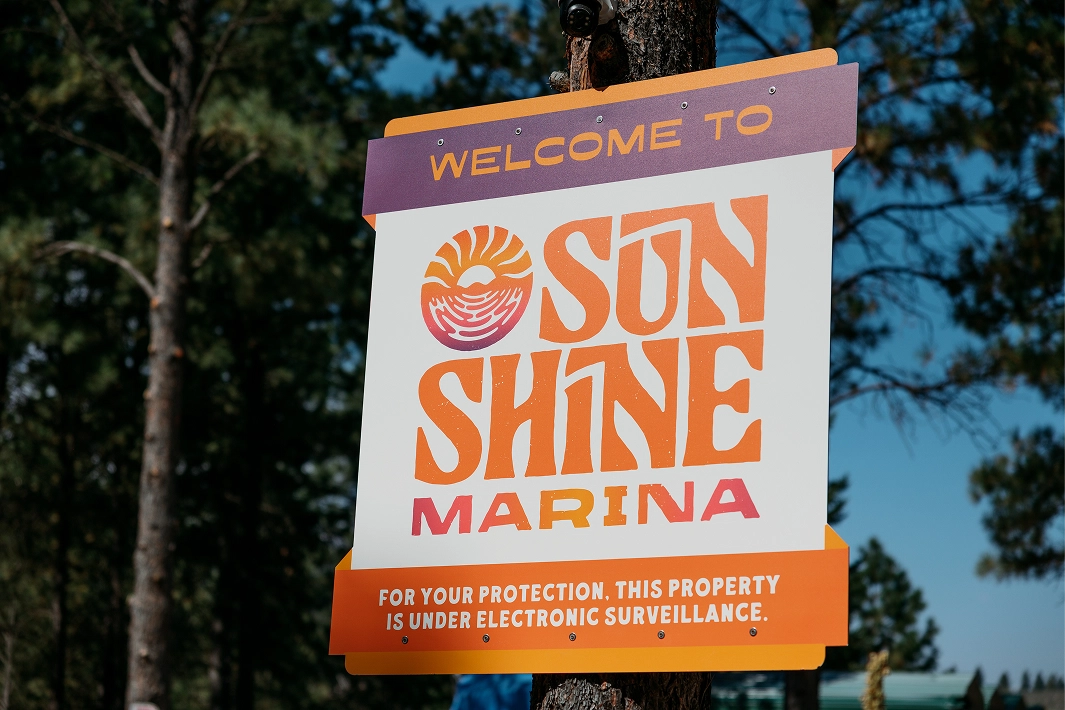
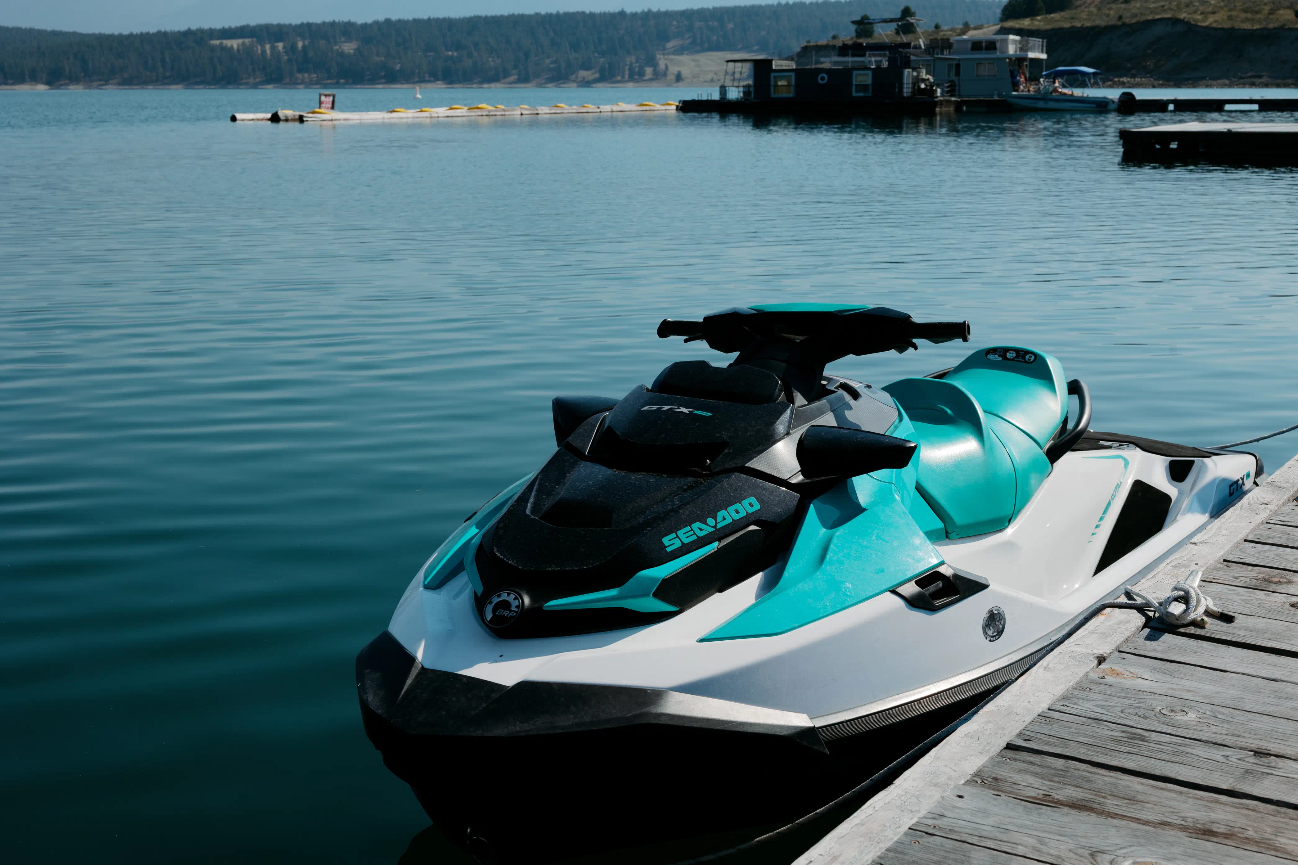
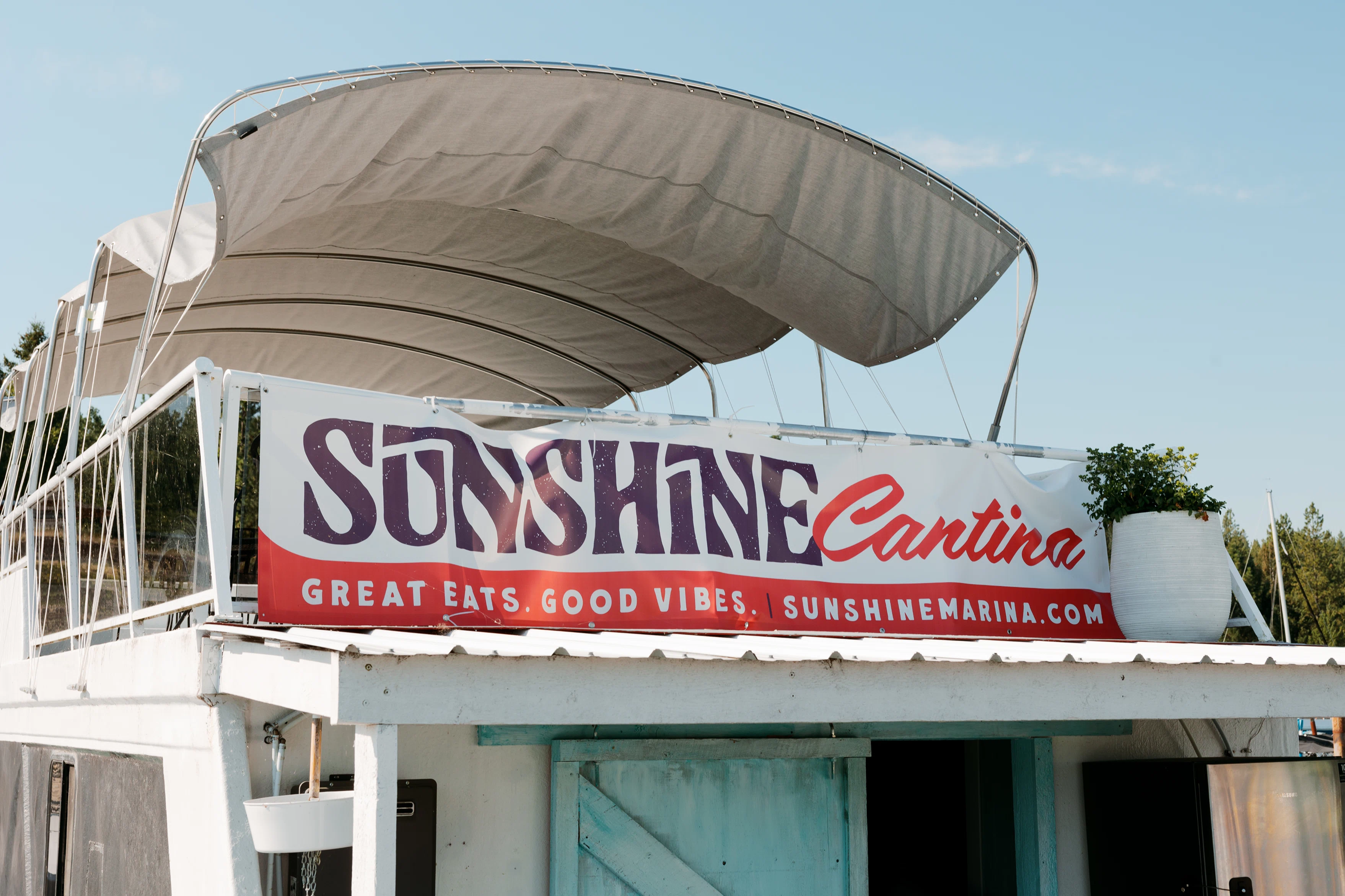
Sunshine Marina
a lakefront resort packed to the brim with summer fun.
Branding | Custom Type | Illustration | Signage

Brand Kit
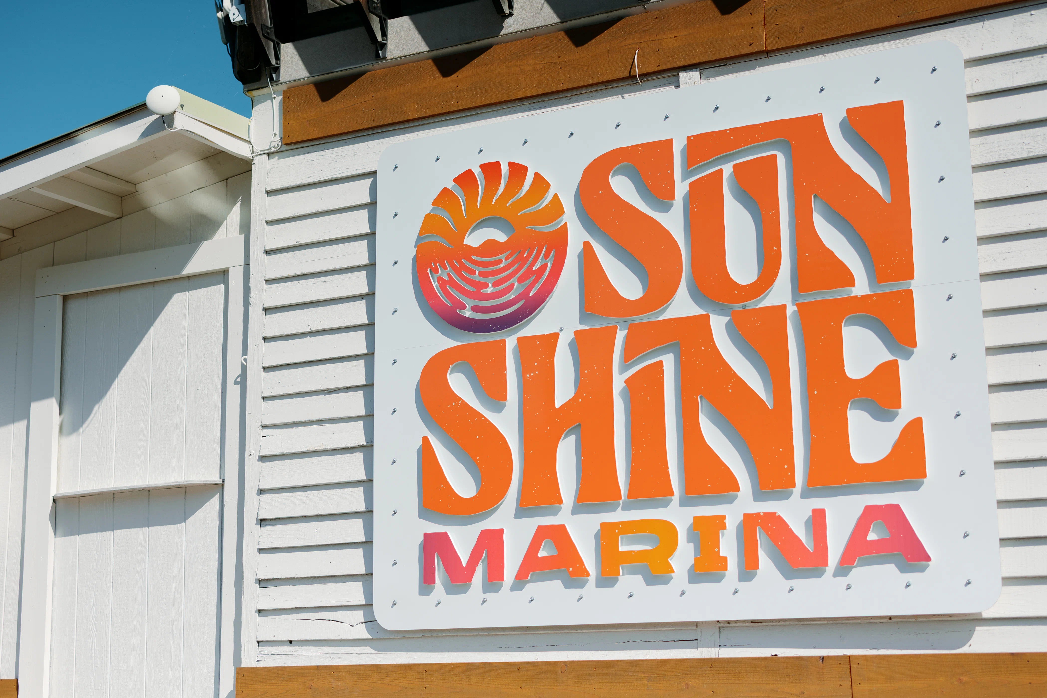
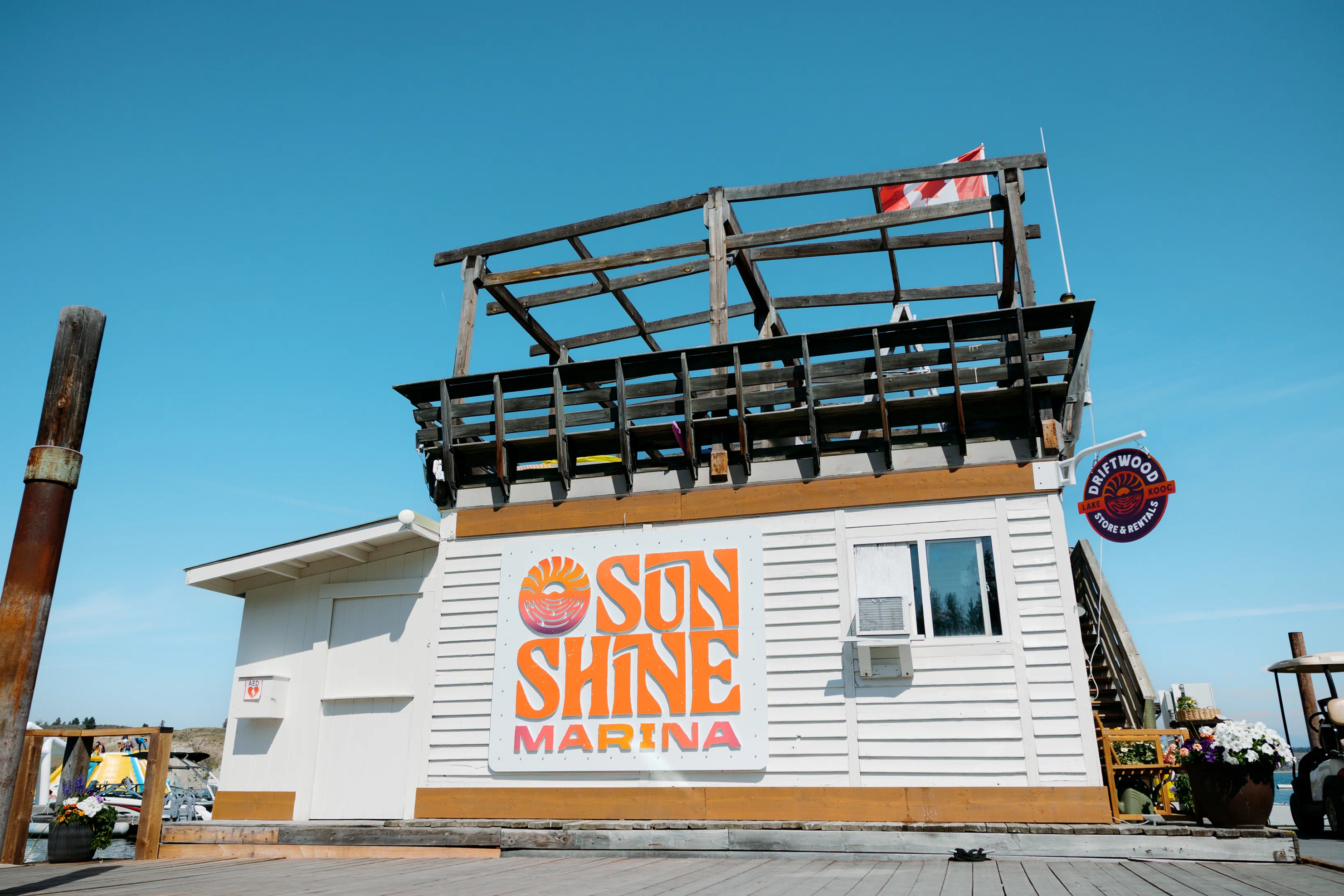
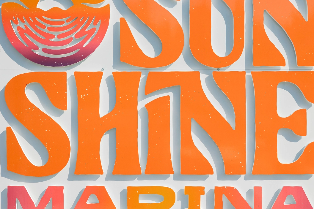
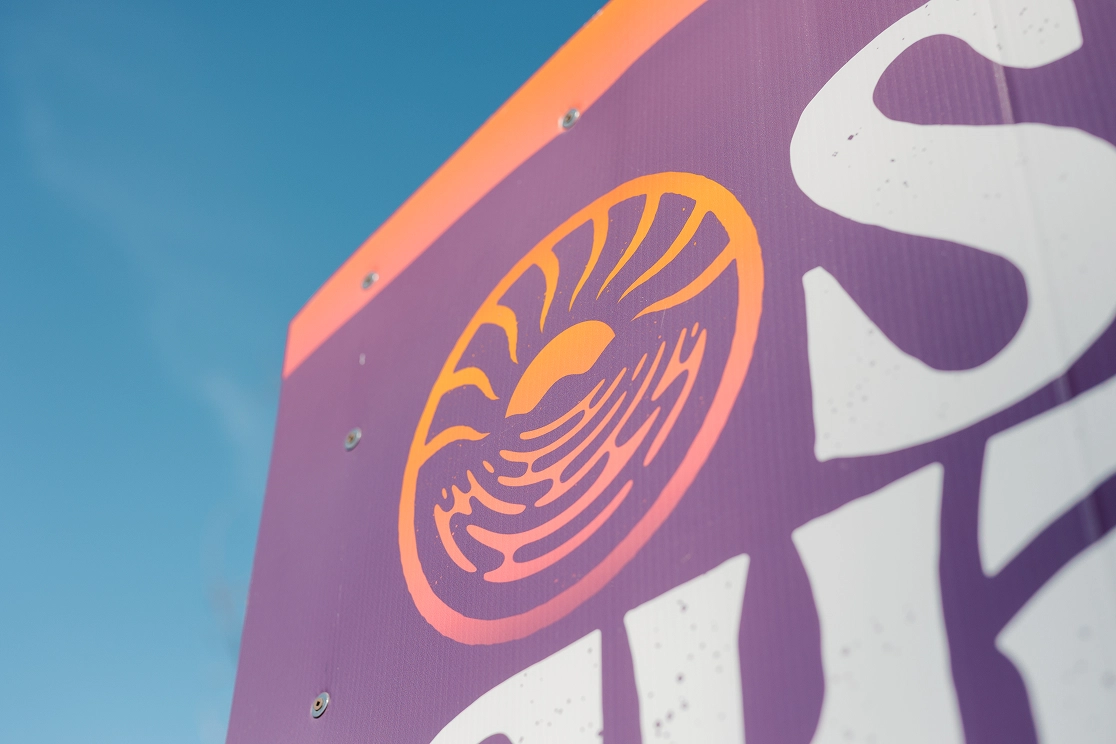
The Sunshine icon is hand-drawn, creating a beachy and sandy texture. Water lines and wavy sun rays capture the dreamy vibe of a day on Lake Kooc, packed with wake & wave action or just bummin’ on the beach.
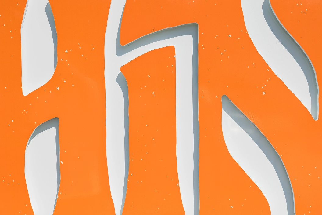
Custom hand-lettered typography continues the sense of motion established by the icon, while interlocking letters create playful interactions that feel just plain fun.

Making it Flexible
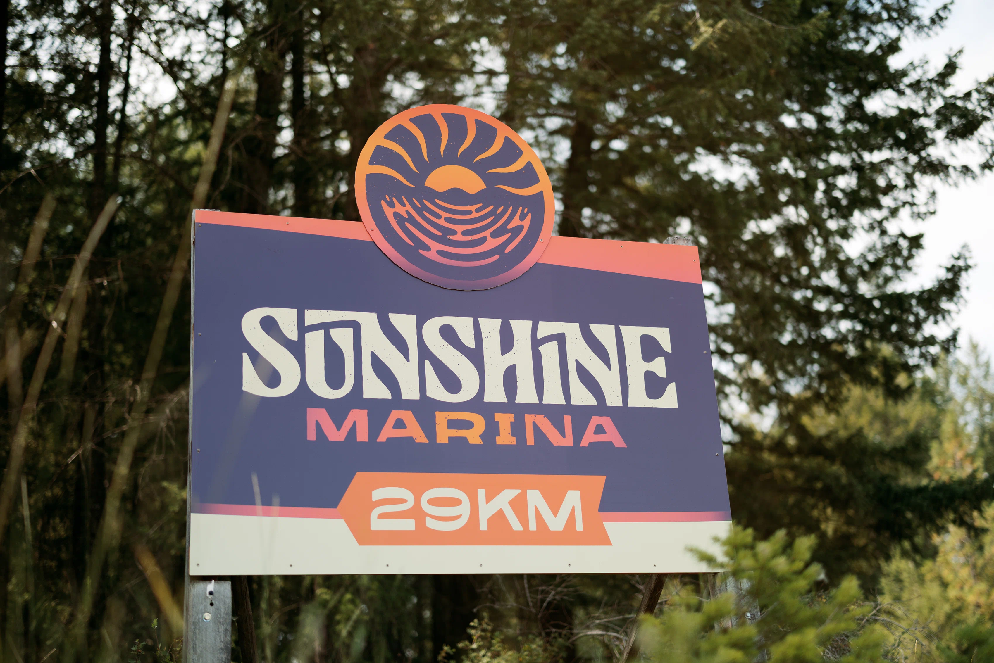
Alternate layouts and compositions make sure that the brand always shines bright no matter the size or aspect ratio.

Type & Colour
Colour captures the varying tones of light the sun casts across the water from sunrise to sunset.
Typography selections are designed to provide a bold, fun & dreamy summer look across all shapes and sizes, while providing optimal legibility.

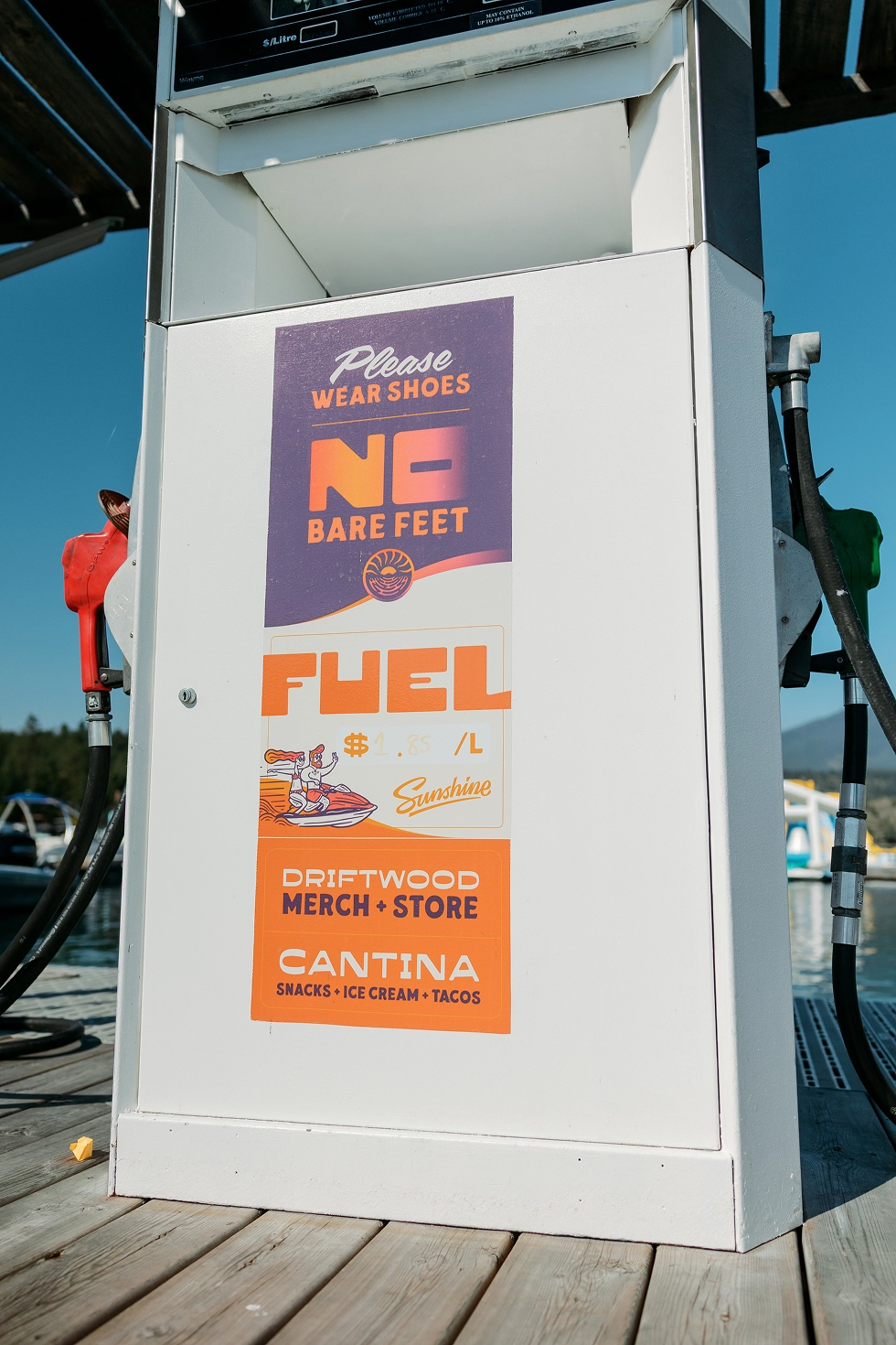


Secondary Marks
A suite of badges and a hand-lettered script deepen the brand story, allowing the brand to feel fresh and engaging without overusing the core brand marks.


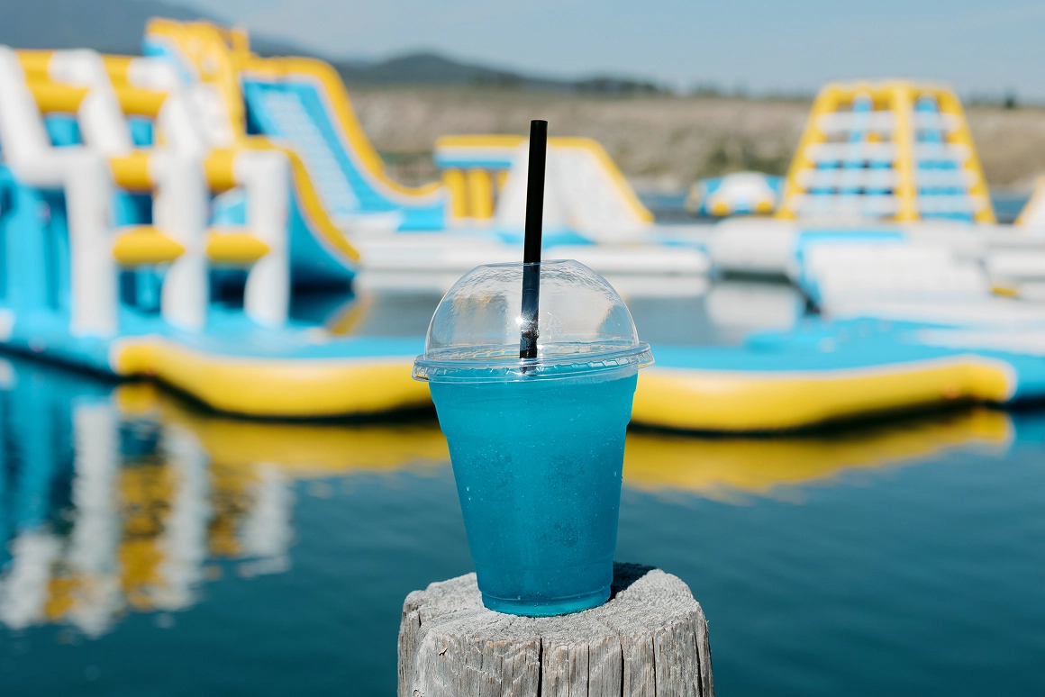
Illustration
A suite of illustrations captures all the ways to spend a day on the water with Sunshine, giving the brand an extremely lighthearted personality and energy.
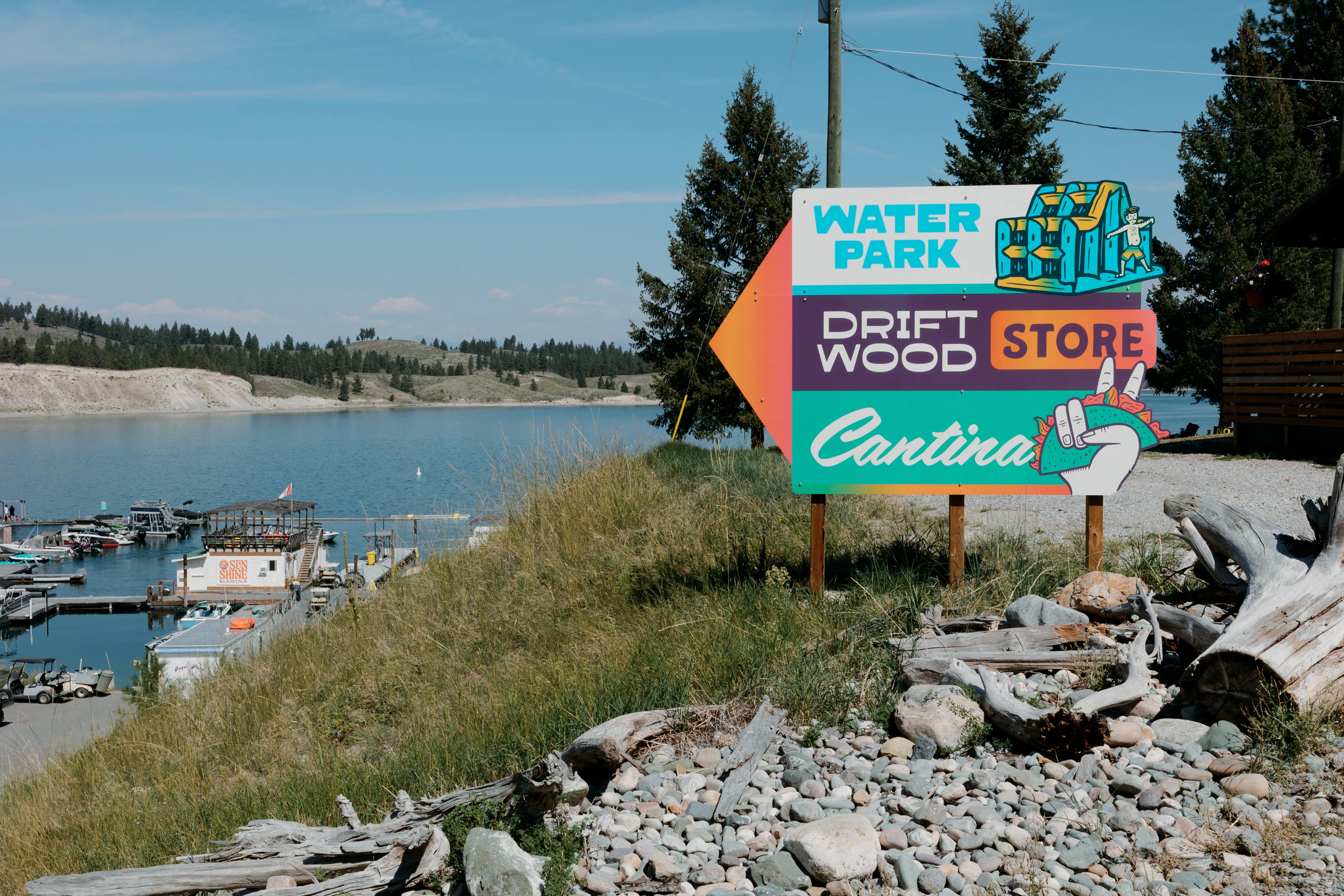
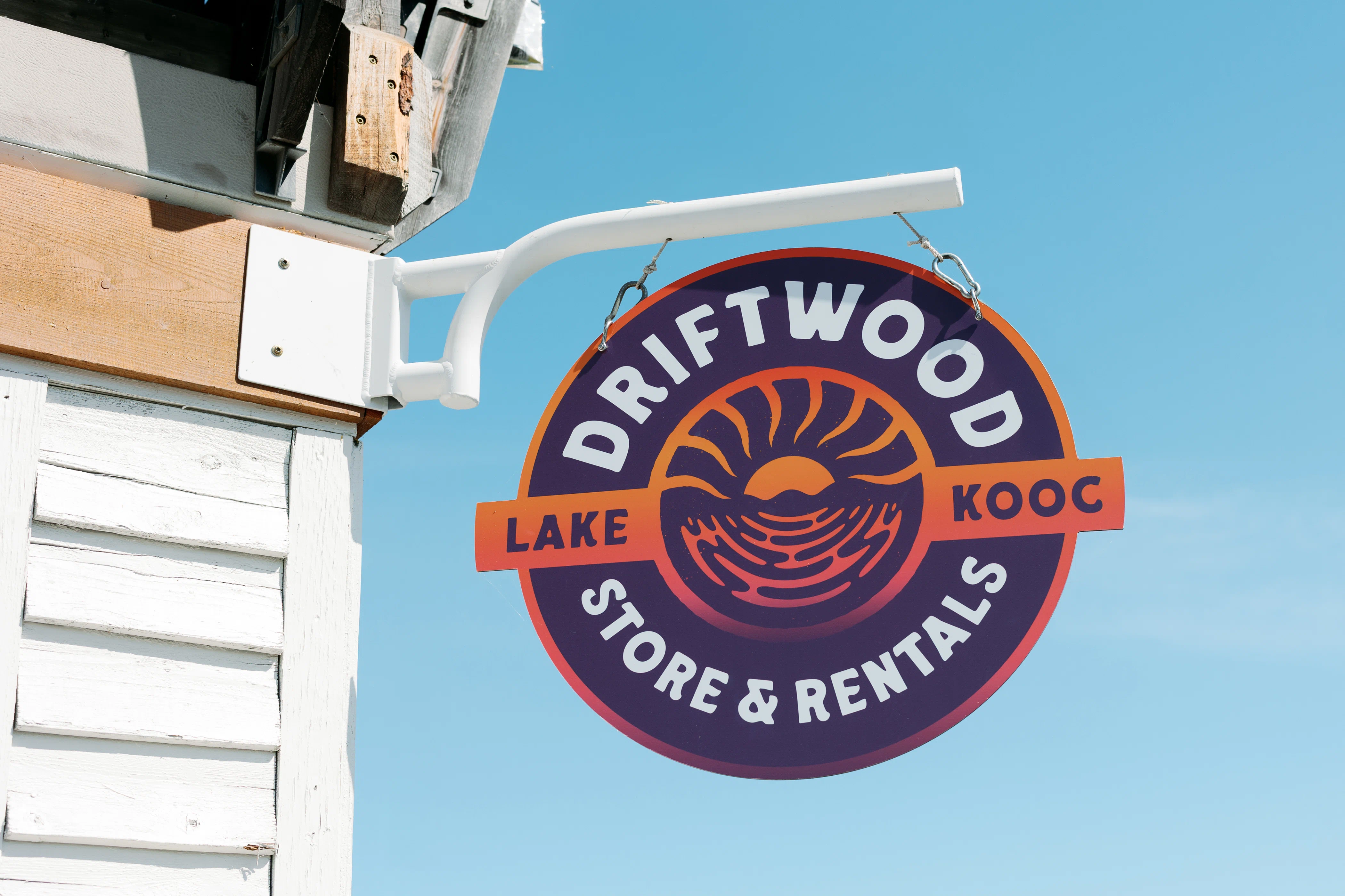
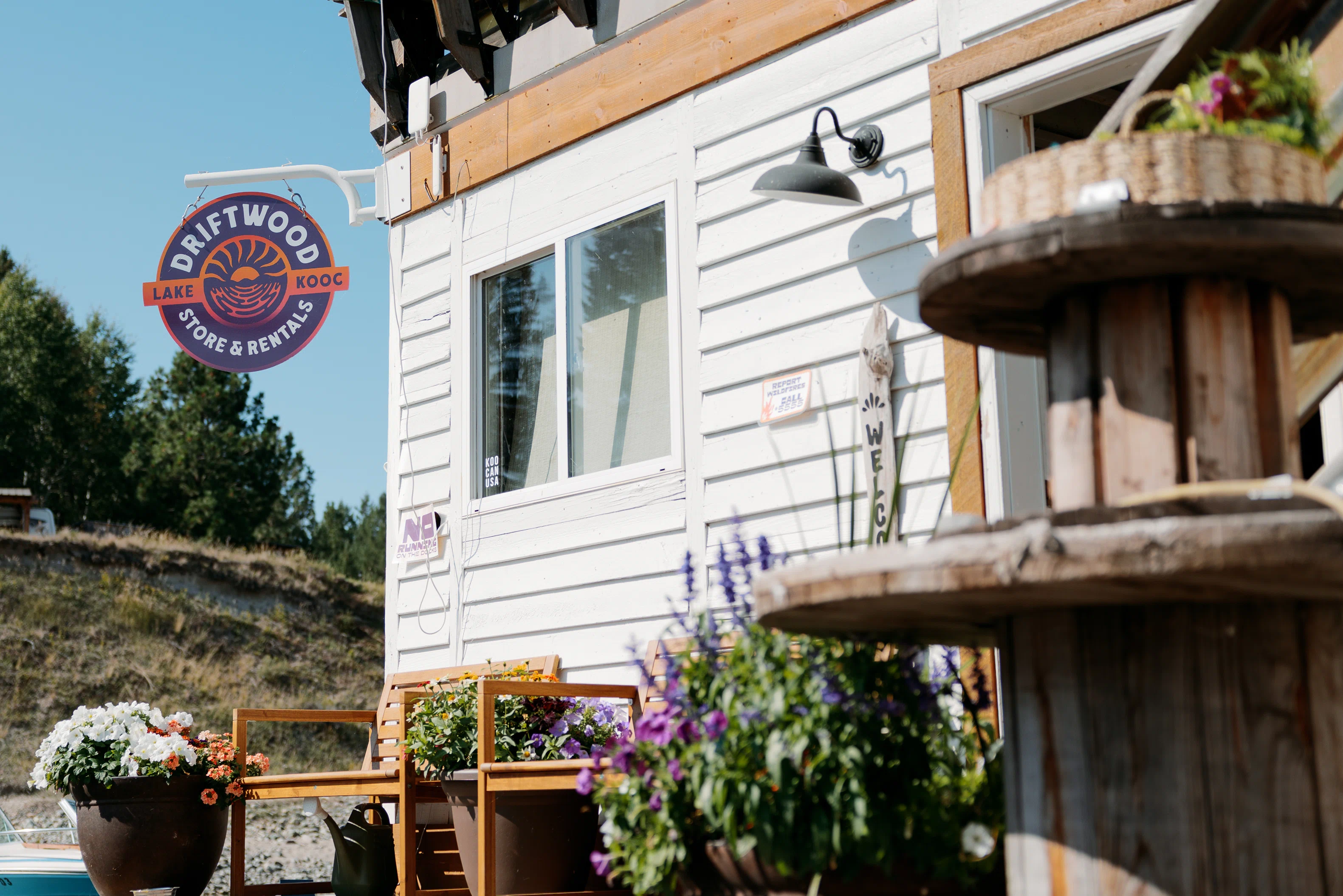
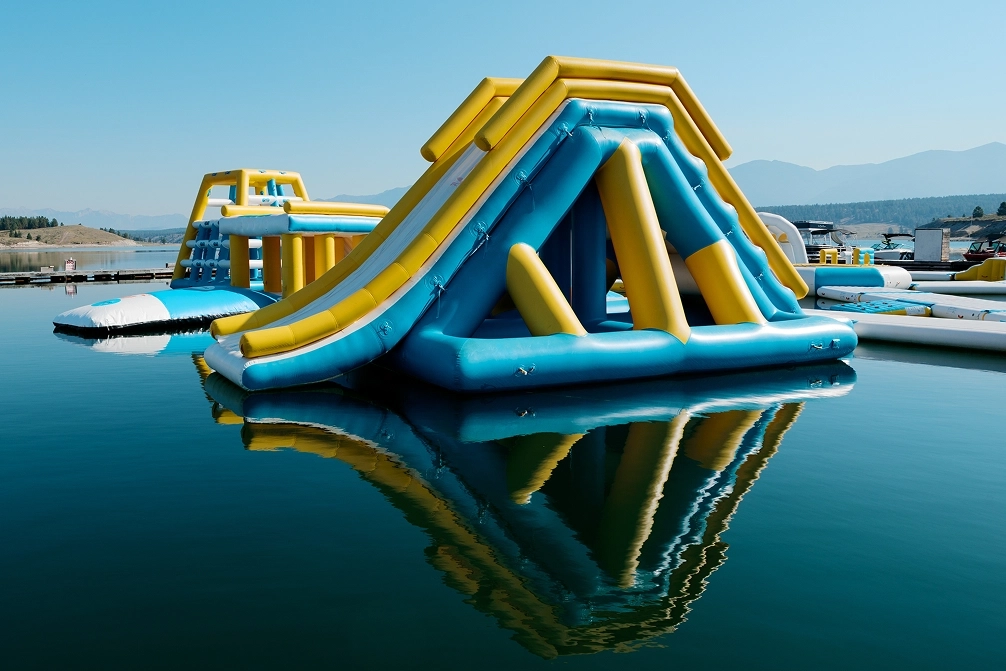
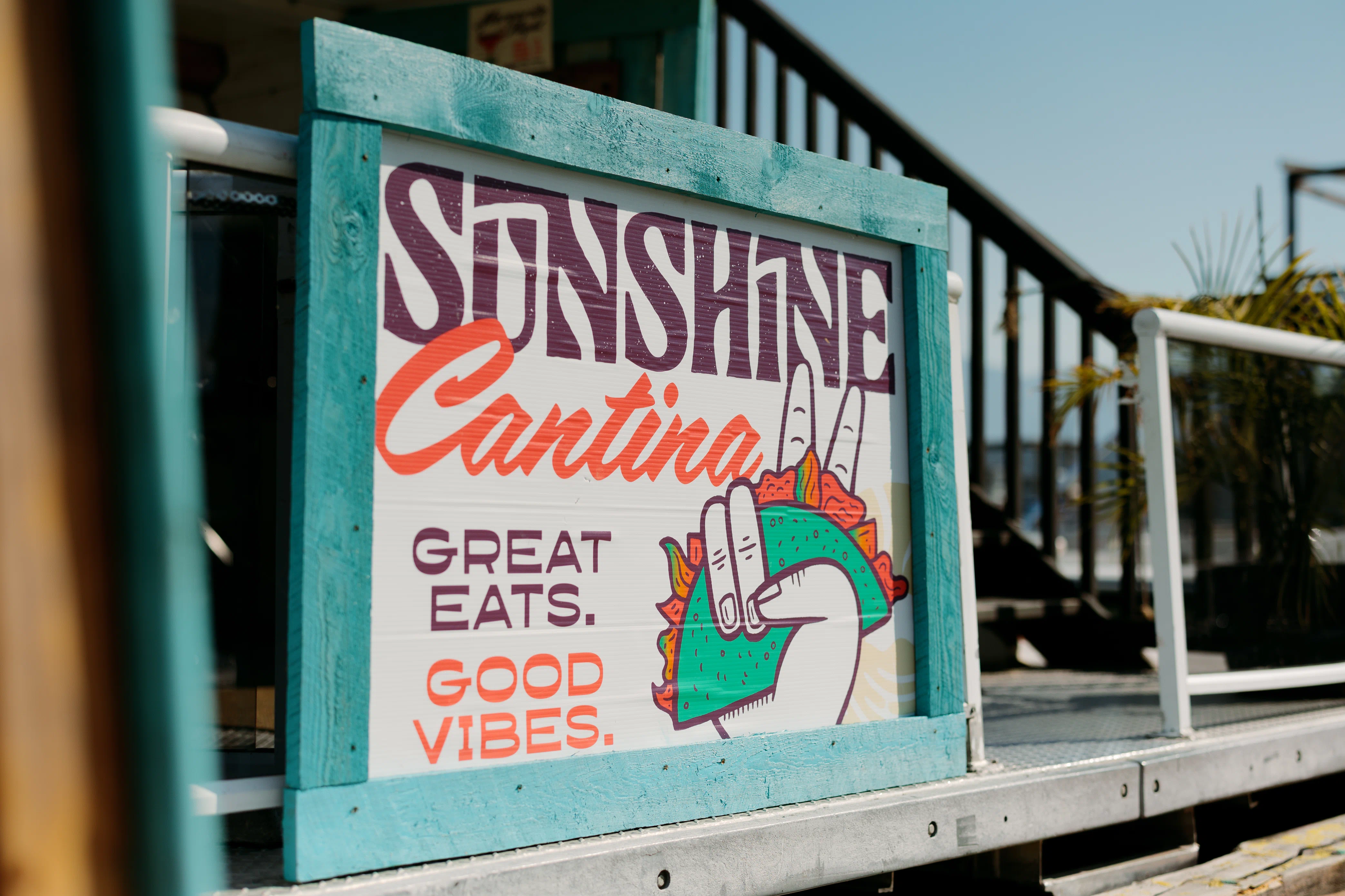
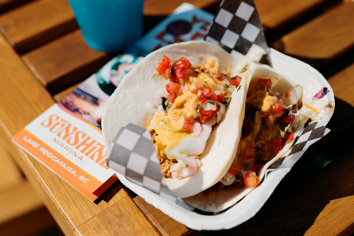
The Sub-brands
To give each wing of the resort it’s own personality and give visitors an exciting experience, we developed sub-brand looks for each, based on the foundation of the core brand.
Alternate colour palettes, unique logo marks, and activity specific illustrations give each area of the resort their own look, while still feeling distinctly connected to the main brand.


While colour & illustration may shift between sub-brands, using the same typography system for each ensures that the ties with the core brand still remain strong.


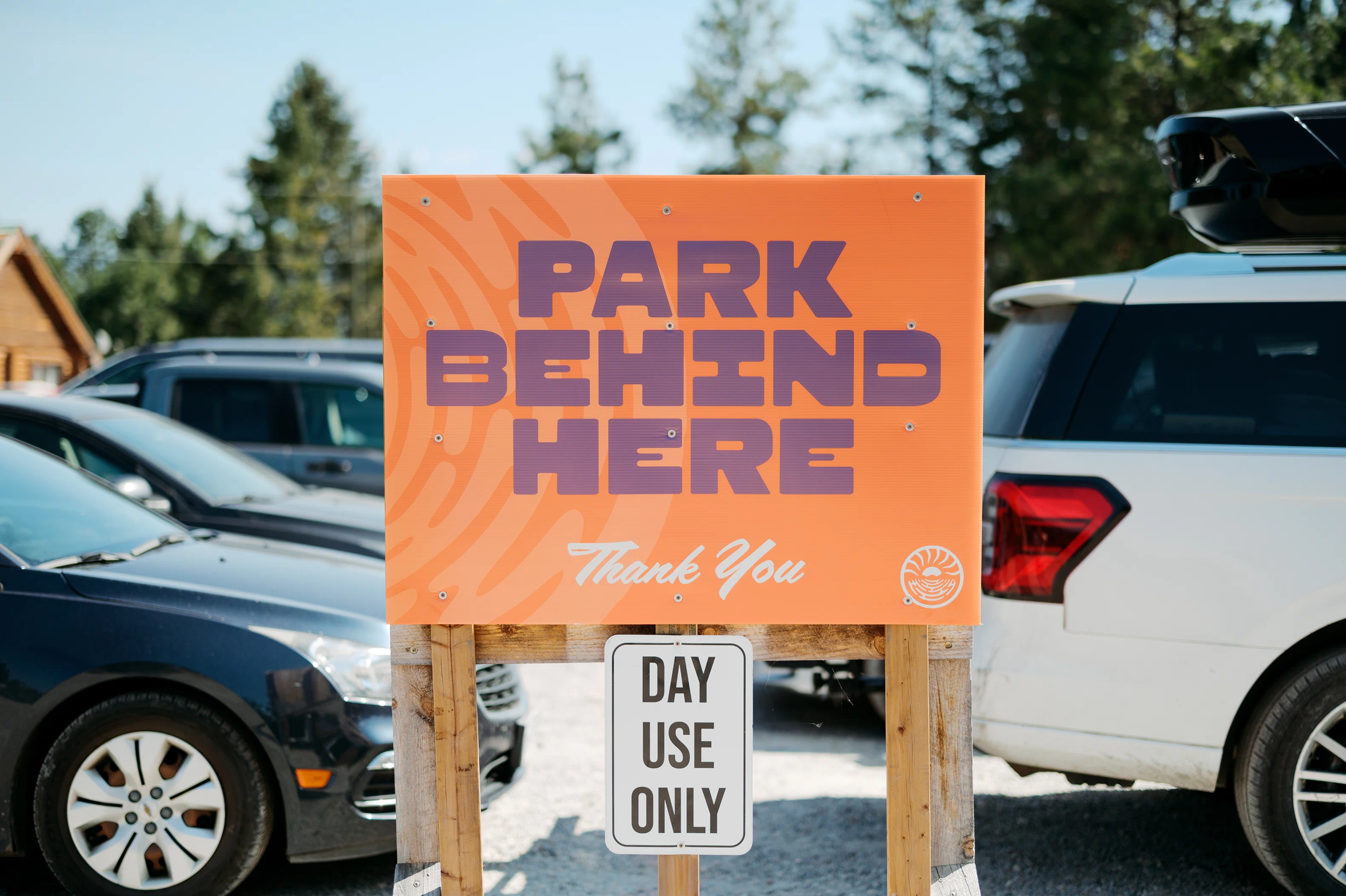
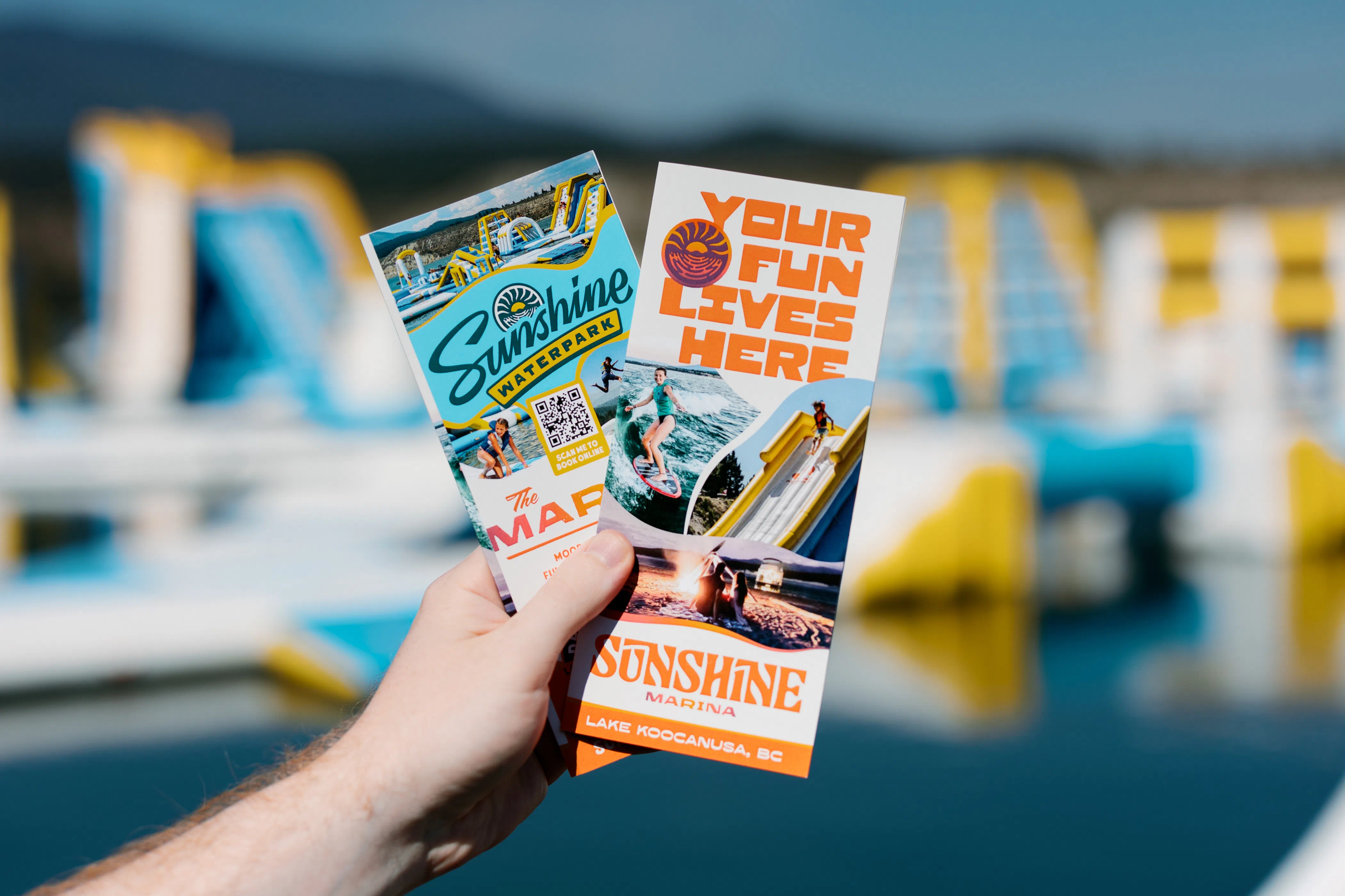
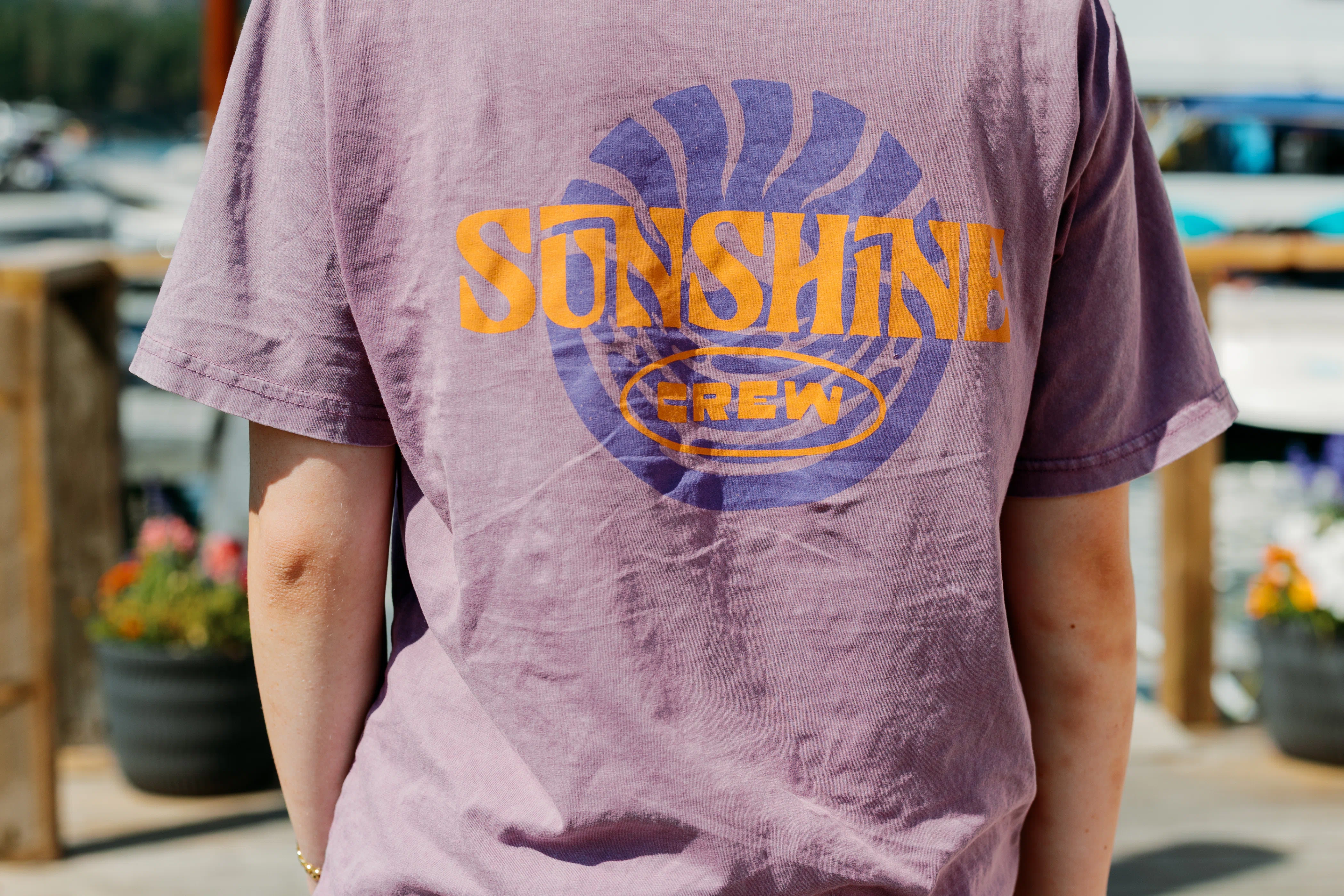
Out in the Wild
Motion & music bring the brand to life in a fully custom launch animation, showcasing the new brand look, feel & vision to Sunshine’s online audience.

craft brewery & bowling alley
craft brewery & bowling alley