


Vantage Hotels
an independent hotel group creating connections and comfort for travellers who love to explore.
Branding | Custom Type | Print Design


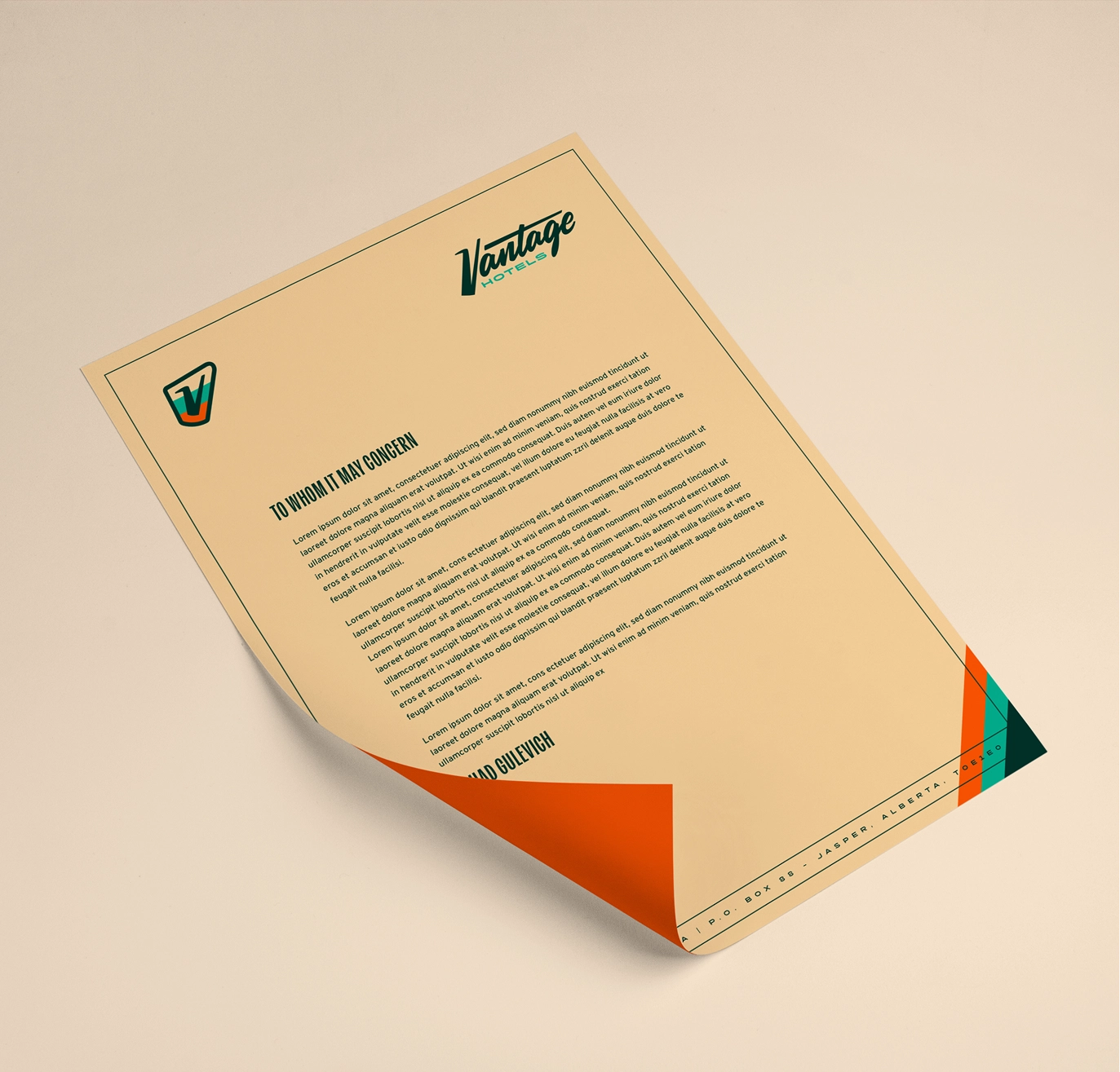
Brand Kit
Inspired by the classic hotel and roadside signs of the 1970s, the brand kit is built around a retro hand-drawn script, capturing the charm of a golden era road trip while still feeling professional and trustworthy.

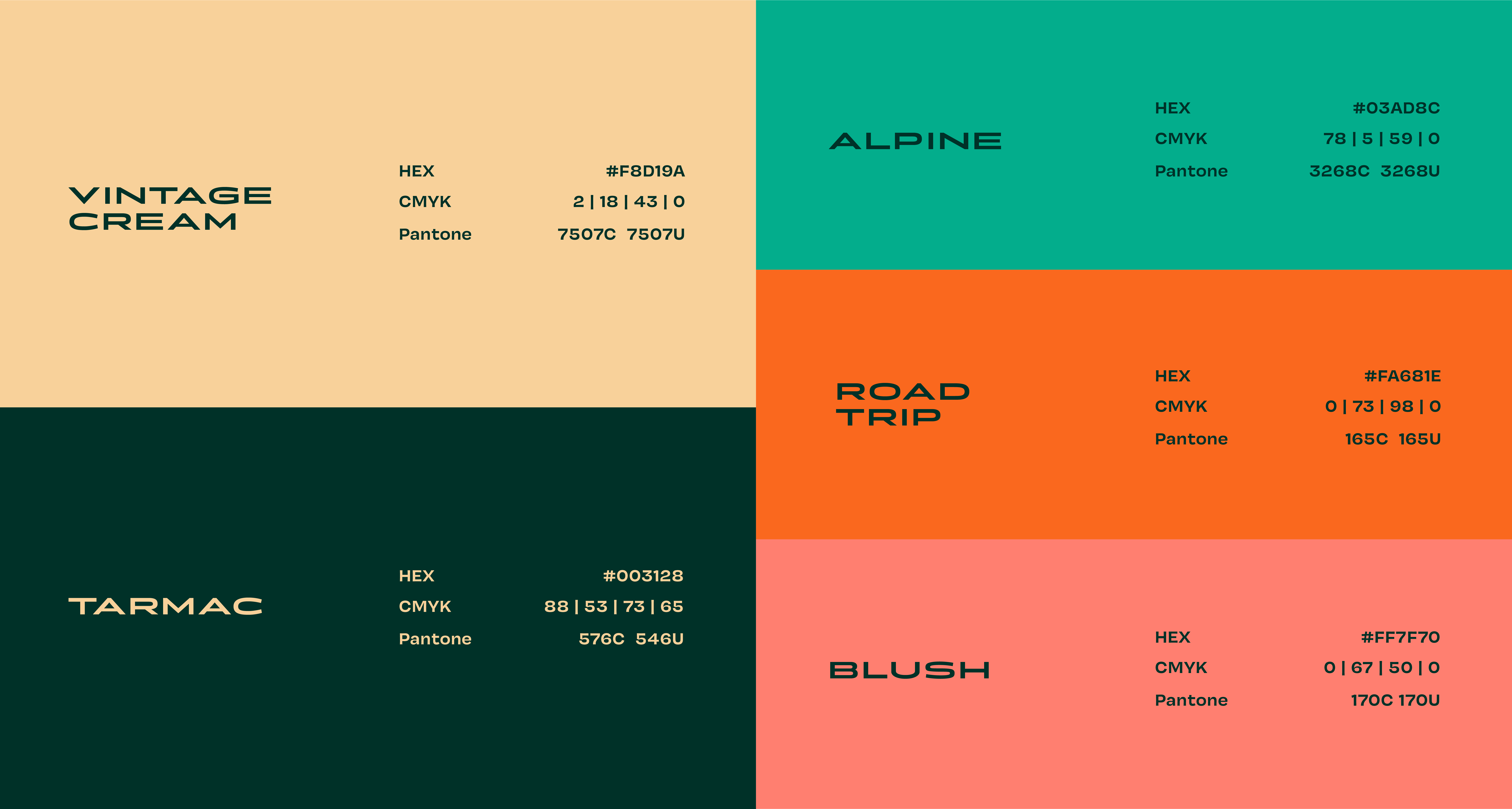
Colour
Using 70s-inspired hues with modern contrast levels gives the brand a timeless feel while still being memorable and distinct.


Typography
The type system is designed to balance retro road signs with modern cleanliness, perfectly balancing nostalgia and functionality.


Overlaps
Brand elements are designed to overlap and interact with each other, creating deep and eye-catching compositions.


Retro Charm
For special occasions, when even more retro charm is desired, the brand features a secondary collection of colourways that authentically transport you back to the 70s.
craft brewery & bowling alley

craft brewery & bowling alley