Hang Time
an online entertainment studio revolutionizing live content creation.
Branding Design | Custom Type | Illustration | Animation | Type Design
The Hang Time brand is designed to capture an alternate reality where every hour is Friday Night – the party never stops, the soda keeps on flowing, and you’re surrounded by your favourite people doing your favourite things.
The Shaka Portal Icon and the brand’s custom type create an angsty, worry-free call sign for this alternate dimension, giving the brand an iconic feel with just the right amount of nostalgia and retro charm.

Colour
The colour system is inspired by palettes of the 80s & 90s, pulling from the team's childhood memories of all-nighter video game sessions and weekend movie marathons.

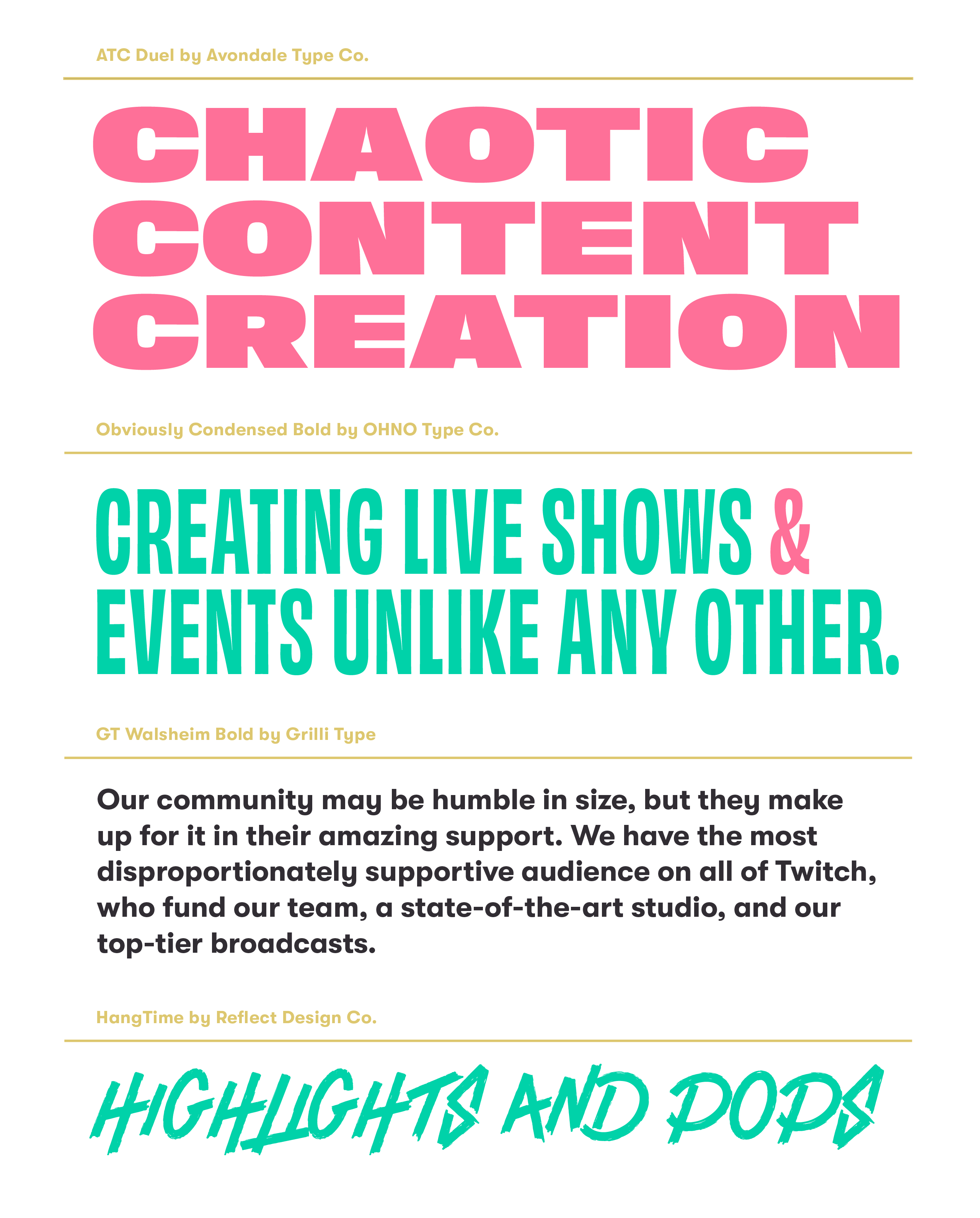
The typography system provides a diverse selection of type that seamlessly integrates with the high-octane energy of the rest of the brand.

Flexibility
The brand system includes a comprehensive collection of alternate layouts and badges, ensuring the brand shines in all situations.

Custom Type
Hang Time’s fully custom display font is inspired by the terrible graffiti inside High School bathroom stalls, the irreplaceable vibe of punk show posters, and the 90s moto-cross graphics that we all secretly love. Inconsistent letter sizing and poor kerning are all intentional choices to bring this brand to a place where it felt approachable and authentic.

Illustration & Animation
To complete the Hang Time universe, we illustrated and animated a colossal collection of iconic objects, activities and snacks to sell that “Friday Night, All Nighter” vibe.


