Vernon Alliance
a tight-knit church community with a mission for growing together.
Branding | Custom Type | Print Design | Animation


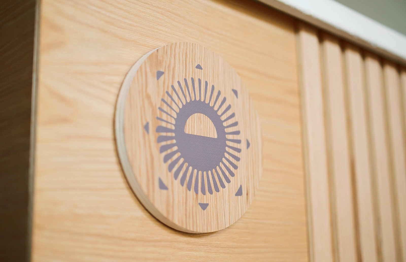
The VAC icon is constructed of seven branches growing from a central point. It is designed to be a perfect symbol for growing together and reaching into a community with a unified vision.
Custom typography fuses historic-style serifs with more contemporary curves and angles, showcasing the brand's longstanding history while feeling modern and exciting.

Colour
The extensive colour palette is inspired by the natural colours around the Okanagan, giving the brand a grounded and natural feel.


Typography
The type system is designed to complement the custom type found in the primary logo, while also being flexible and easy to implement -- a playful combination of modern lines and hand-drawn scripts.

Layered Scripts
The 1950s-style custom script pays homage to the early years of VAC, adding a retro touch that gives the brand an extra level of story.
We created a system for layering the elements that gives the brand a natural and organic depth.


Socializing
The brand includes a toolkit of templates to prepare the VAC team for success as the brand enters the real world.
Motion
A brand launch animation makes for the perfect tool to send the new visual system into the community.
craft brewery & bowling alley